Edward Weston - PepperThis pepper has lots of curves within the image that it different and unique compared to any other pepper, I think that Edward western wanted to accentuate the curves of the pepper through the use of light and Dark ( Chiaroscuro ) . By illuminating the pepper from above the pepper has lots of shadow were the curves are which emphasises the shape of the pepper and exaggerates the texture and curves within the skin of the pepper. Each different layer and section of the pepper depending on how far/close to the light the section is. The closer parts at the top of the pepper have a more illuminated effect were as the part at the bottom of the pepper that are further away from the light have a darker, more subtle effect.
|
CHIAROSCURO
Italian for light and dark. Meaning a clear tonal contrast which are often used to suggest the volume and modelling of the subject depicted. Using Chiaroscuro often adds emotional effect to an image. Leonardo Di Vinci and Caravaggio are some of few artists which have been famed by their use of chiaroscuro. Before the use of cameras Chiaroscuro was used by painters. Nowdays artists such as Silvia Grav and Elliott Erwitt uses chiaroscuro to create the contrast effect. 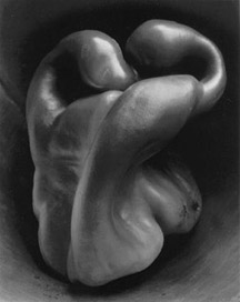
|
Our experiments in the studio
Edward weston- Pepper inspired photographFor this image i decided to use orchid flowers as i have always loved their unusual shape and i also thought that the shape of the leaves and the centre of the flower would create the soft yet textured effect that Edward western created in his photographs. To light the orchards i had a small light directly above the flowers as this is what Edward western done in his image peppers. I also had another small light to the left of the flowers to add more light to the background on the image, this increased the depth of field within the image. I think this image was a success and i would like to experiment with other objects besides flowers to see if i can create a similar effect with a range of objects. I did multiple experiments with the lighting in this image and i found that the shadows in the flowers gave the petal and the centre of the flower more shade and depth creating the illusion of more
curve within the flowers. |
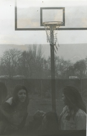
These images were our first attempts at this contrast topic, We took turns in our roles during this shoot alternating between: model/s , director/note taker, lighting director and photographer. After the first few attempts at this we managed to get the lighting in the right position so that it was only shinning on the models face. We did this by having the light close to the model but facing away from the model towards the camera, this meant that there would be no light on the background and there would also be no shadow of the models on the background. We didn't really focus on the facial expressions of the model we wanted to get a feel for the lighting positioning and the type of camera shots that worked the best in this topic, in my opinion having the camera zoomed onto the face but slightly to the side of the frame worked the best if there was only one model as it reduced the amount of space in the image. When there was two models space around the models gave the image a majestic, calm feeling which worked the best with the monochrome effect of the images.

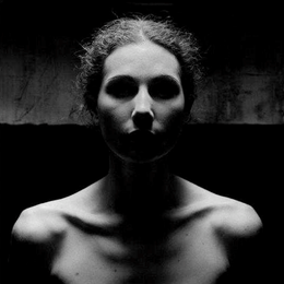
In 2008 Lee Jefferson took a photo of a homeless girl at the start of a marathon. After this experiment he carried on but he wanted to connect with subject, through the use of facial expressions and eye contact. Jefferies wanted his art to honour these people, not pity them. By infusing them with light and not darkness onto their faces he gives them a greater meaning and likeness. Lee Jefferson did not intent this at photojournalism nor portraiture, he intended it as " Spiritual iconography" |
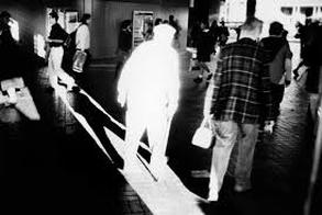
Trent ParkeTrent Parke uses natural light to create a black and white image with significant contrast. By over exposing the subjects of the images to harsh light the subject then photographed with this spotlight of harsh light just on them and no one or thing in the rest of the image.
Dark shadows and no light in the background of the image create the contrast within the image. He does this by only letting a little bit of concentrated light in through a door or a curtain. By controlling the light this means it only hits one point in the image. |
|
Silvia GravI really like the work of Silvia Grav as there is very strong contrast which I really like as well as that, she uses different strength lights to create the deep contrast within her images. I like the fact that she really experiments with her photographs and that every one of her images are different. the subject is always in different poses and it is not always just the subjects face in the image that is illuminated, there bodies are often in in the image and also in a few of Gravs images the back ground is illuminated and the subject is a silhouette which really makes the image have an abstract effect as it is something different that you don't usually see in the Chiaroscuro theme.
|
Pirjo KeenePirjo Keene uses digital photography and other digital methods to create his images. I think that Pirjo uses an editing software,
to create the multi-tonal and multi-textural theme that is in all of his images in this series of images.The rough textures within these images create and emphasis the contrast within the images, as only the lightly shaded and shadows sections of the image have these textures. All of Kennes images in this series are all very similar, they all have lots of texture. The images have a shallow depth of field except from one image of the trees which have a long depth of field. "Photography is not a sport. There are no rules and everything must be dared and tried." |
|
Tom Hunter Tom Hunter uses harsh light which is specifically pointed at the subject or subjects of the images to create emotion. There is lots of emotion in these images as people are being given their eviction notice from were they live. At this time lots of Artists lived in one area of abandoned houses but the artists were informed that they had to leave. Tom hunter decided to capture the emotional significance within the images by using lots of contrast within the image. In some of his images the subject is sometimes slightly out of the light, this could have been done purposefully to show just how upset and down they were feeling. There are lots of reds and blacks in the images and those colours have lots of negative connotations with them, which Hunter probably used to his advantage and to help him with the contrast. Homework 25/03/15 |
Elliott Erwitt Elliott Erwitt uses natural lighting in his images to create the subtle contrast between black and white. in these images he uses reflection and silhouette to create the chiaroscuro within the images. Elliot uses soft, natural light in his images to create the effect of Chiaroscuro. Elliot Erwitt uses different methods to get a different effect within all of his images. In some of his images he creates silhouettes to create the contrast effect, and in some he uses reflection and focus to create the effect. Personally i prefer the silhouettes as they add a bolder more significant contrast effect. He uses the light from the back ground and the shadow in the foreground to create |
|
|
I focus theses images around different types of lines in every day life. I feel that these images successfully portray the theme i was aiming for as they show all of the lines that we don't notice in every day life but are always there. I think these images work because they are all taken from different angles and perspectives. And are all individual. I kept some of the images in colour as they have a rainbow in the background and this adds a bigger depth of field to the image that would not be seen in black and white. In these images there are lots of different tones. In all of these images i have used natural light at different times of day in different places. I did not want to take any images in side as i wanted to include the things around us. |
|
School Experiments,
These images were inspired by my research on Silvia Grav, as it focuses on the singular person. This series of experiments i decided to experiment with natural light illuminating the subject of my image. I was also experimenting with the position of the subject to the camera to see which angles gave the best light. I really liked the images were the subject is really natural and not acting stiff. I really liked having the school building as the background as it gives the image a larger depth of field and makes the image more natural and also gave the image more texture within the image. When illuminating the subject i only wanted the light to shine on one half of the subjects face as this adds more contrast to the image. I also experimented with how far away the camera was to the subject, to see if this would add any more texture and to see weather having less space within the image would exaggerate the contrast. |
Homework 14/4/15These images were inspired my the research i did on Pirijo Keene as all of the images are outside with lots of line. In the majority of these images i used shadows to get the contrast effect, I also focused on line throughout these images. I also used natural lighting to get the shadowing and other effects in these images. I took images inside my home and outside so that i could experiment with a range of different light strengths and intensities. I also took images at all different times of days which also gave the images a range of different effects and light strengths. I did not want to add any effect to these images as i thought that they would look best in colour. Some of these images are very simple with only one element within the image and some are more complex with lots more elements and more intense light which helps make the images look different. I think that this experiment was successful as i was able to create 10+ images focusing on contrast with the use of natural light. I could use photoshop to make these images black and white, which would make them look more like the work of Pirijo Keene and it would also increase the level of contrast within the images.
|
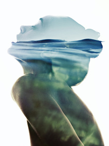
Aneta IvanovaI was really drawn to this image by Aneta Ivanova, I like all of the different lines and shapes created by the wave, i also was drawn to all of the colours, tones and textures created by the waves within the silhouette of the image. This image was done by using photoshop, Within this image you get the detail of the person, such as the eyes, nose mouth and eye brows, you eve get some of her skin colour mixing with the colours of the sea which gives it a very tonal effect. I really like the colours within the image as they draw your eyes into the image and make the image stand out more. if the image did not have the green tones in then i do not think the image would have such a great effect. 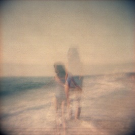
Diado MoriyamaThis image by Diado Moriyama really stood out to me above the rest of the image i saw. I think it was that lack of focus within the image creates movement, this movement really drew my attention to the image. This image has been over exposed as the lights on the building are blindly bright and the intense darkness of the floor backs up my theory. These effects creates a high contrast effect. The movement in the image makes the image seem really busy.
|
This image really stood out to me and i tried to look for an artist but i could not find one. This image an ideal example of what i would like to end up with at the end of this project. I really love the fact that the image is not in ficus and that the image is of the same : person and place but just at different times. The image is given lots of texture by due to the lack of focus and the shift in places , due to the different shot angles. This image has lots of contrast, some int he corner of the frame to the sky and sand. The sand and the sea also have strong contrast.] 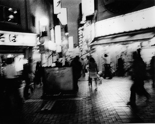
|
Idea 1


After my Artist research on Aneta Ivonova, I thought that this would be a good idea choice as it uses many techniques, these images are created using photoshop but can also be created using a film camera and cut out onto a white background, i would like to experiment with both of these techniques. These images give the effect of a double exposure. I could also find and use some online websites that allow me to overlay multiple images. I like the fact that the contrast in these images can be represented in a multitude of ways, for example it could be the contrast between the foreground and the back ground, but it could also be the difference between the human and the nature that fills the side profile of the person.
Experiment 1
|
During one of our lessons i decided to go into the dark room and experiment with different exposure times when using the enlarger to develop negatives, as I knew that I would need them in the future on this topic. I used a 5.6 aperture. I placed a A2 sheet of photo paper underneath the enlarger and aligned the image to the paper with the red light on so that the image would not expose the photo paper. Then using a lid of a box I covered the photo paper leaving a small section exposed, I then removed the red lens and exposed that strip of the photo paper for 5 seconds. After the 5 seconds was up i slid the lid across revealing another unexposed segment of the photo paper along with the pre exposed strip and exposed them for another 5 second causing the first strip to now have a longer exposure time. I repeated this along the paper until it was all exposed with the first strip being exposed for 30 seconds and the last strip being exposed for 5 seconds. After developing this in the developing chemicals I could see a clear difference between each exposure time. From this I could decide which exposure time was ideal to enlarge negatives. 10 seconds. This was because I was able to see lots of detail within the trees and I could also see that the image was clear and perfectly exposed that the image was not too light or too dark. To develop this work further i could experiment with different apertures, keeping the exposure time the same. |
Experiment 2


Using the information i got from the last experiment i did, i decided to experiment with the different apertures, but keeping the exposure time the same, 10 seconds. I used the enlarger once again and placed an A2 sheet of photo paper beneath the enlarger lens. Making sure that the red lens is covering the main lens .I aligned the image to the paper, one aligned i removed the red lens and exposed the photo paper for 10 second making sure that the image is in focus. Then i developed the image in the developing chemicals and repeated the experiment with a different aperture. I used three different apertures: 8, 5.6 and 4. 5.6 was the original aperture i used in the first experiment, i used this in this experiment also to use as a comparison for the other photographs to come. I chose a negative that had lots of detail in so that i could see the full effect that the different aperture levels made to the image. In my opinion using 8 aperture for 10 seconds worked the best as lots of detail within the trees would be seen and the image was very clear, The image that worked worst was the 4 aperture as it gave the image a really dark effect and the image gained almost an over exposed look. To develop this work further i could used colour film and some experiments of photoshop or in the darkroom to see what i could change or create. I could also use photo shop to do the same with these black and white images. Next i am going to take some double exposures using a black and white film camera and get them converted to negatives, once made into negatives i am going to re do the experiment using the appropriate aperture and the appropriate time.
|
Using previous research from the abstraction topic, i feel like doing something like this to the enlargements i have made in the darkroom previously. By cutting up the images into fragments i can either re-attach or i can re-arrange the different fragments, to create a new image, out of an old one, Another think i may be able to do is make a new image out of two different images. The contrast could be the different images next to each other. |
|
|
|
This video was made using an app on an Ipod. I made this video as a practice for when I use the super 8 camera to create another cine film. I took multiple shots which were all different from the next, this was to see what the different scenes would look like, i would also be able to see which ones looked best and created the best look, this would help me to plan what i would be able to do to get the best effect. |
Double exposures using pic monkey.
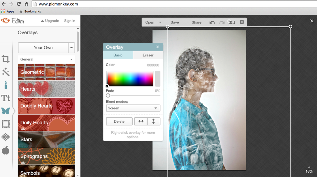


For these images i used Pic monkey an online application for photo editing, I made the subject of the photo in colour, and the overlaying image black and white that i had previously taken, using the screen effect i got the perfect balance of the overlay so that the subject was not totally covered but you could clearly see a print and pattern over the subject. I also used the eraser to remove the pattern from the background. This made the effect of the overlay only cover the subject and not anywhere else. I think that these images worked really well as they all give the double exposure effect that i was looking for. I varied the type of overlays used, i used the sky , plants and animals All of these images are my own. All the overlaying images were different but they all followed a nature theme, which created another element of contrast. The next step to develop these images is to turn the subject/ background of the image into black and white and overlaying the same images over the top still in black and white, my aim for that is to see if increases the level of contrast.


For this set of images i did the same thing for the previous set of images. I made the subjects of the image black and white. I used the same effect of screen over the subject on the overlay and once again erased the background so that it was plain and all of the focus was on the subject of the image rather than else where. I prefer these images to the ones done on the previous set of images. I am going to use both sets of images to create a final piece i am not sure whether or not to have them as two individual final pieces of 4 or whether to have them as one big final piece of 8. To refine these images i would put the subject in black and white and then the overlay would be in colour. Both the background and the foreground images are my own images, i have not used any images that i have not taken myself to create these pieces.
Final Evalutaion
I have explored various artists' work during this topic, artists such as Aneta Ivanova, Diado Moriyama, Tom Hunter,Elliott Erwitt, Silvia Grav, Trente Perke and Pirjo Keene. I discovered some of these artist through the use of Pinterest, other i found through the people around me that were talking about the artists they have researched and showing me their work that i discovered their work and that it was similar to the work that i aimed to produce. These artists have inspired me and helped me to explore the different ways that contrast can be presented in photography. Before this project i thought that contrast could only be expressed in colour between black/white, light/dark I did not even think about the contrast between buildings and plants or between the different ages of people living at the same time. But these photographers have helped me see that there is a wide variation of ways to express contrast that myself and many others have not even considered to be contrast. I have mostly been influenced by the work of Aneta Ivanova as when i saw her work i instantly knew that that was the type of work i was interested in completing. I used her work as inspiration for my first final piece where i took a few class mates, captured an image of their side profile and overlayed an image of nature, and something that was very different to them, for example swans and plants.
I wanted to create at least two different series of photographs that were simiar and different at the same time, i wanted both of my final pieces to be along the lines of double exposures. So when doing my research I looked up the different types of double exposures, the first i found was using a flim camera, the second i found was an effect you can create on photoshop and other applications online, such as picmonkey. These were but two initial ideas that i planned to carry out through my project. To start off with i did some experiments in the dark room on how to develop film negatives onto photographic paper, as i wanted to see how this worked. I experimented with the different apertures to change the tone and texture created in the enlargements. I then did some artist research on photographers that created double exposures using film cameras. From the research i had found i then tried to create my own double exposures, but they did not turn out very well due to the fact that i was using an untested old camera. I then decided to move on from using the film camera and go back to it at a later stage in the project. Using the artist research i had previously done on Aneta Ivanova, I moved on to using application such as picmokey to create double exposures. First i took some images of the side profile of a few classmates. I then uploaded them photographs along with some landscape images that i had taken previously. Then i uploaded the side profile images onto the picmonkey application and then overlayed one of the landscape images on top, then using the screen edit i adjusted my image to the position i wanted it to be in to create the image i was aiming for. The Final pieces that worked the best are the images of the double exposures that were created using Picmonkey as they turned out exactly how i pictured them to turn out and they used a range of different media techniques, some of which include photo editing websites and a digital camera. Well doing my experiments i have thought of lots of different ways to develop the images further, for example experimenting with the colouring of the images. for example changing the images to back and white rather than colour.
during my experimentation i used a range of different types of equipment, i used a film camera, a digital camera, an enlarger, developing chemicals, photoshop and other photo editing software. I used these resources to enlarge negatives onto photographic paper using the enlarger i was able to experiment with the different apertures and i could change how focused the images are which will also effect the texture within the images. Changing the exposure also effects the tone and contrast that would be produced at each different time of exposure. I had to experiment with each factor and decide which combination of them all created the best image quality. From there i would be able to create a series of images that would be good quality and would be able to be developed further on digital equipment or could use that as a final piece.
I chose to have * images as my final piece, the images are very similar but they are also quite different, I chose to use so many images as a final piece due to the fact that they all work well together and also it increases the level of contrast in the piece. If i wanted to have less images as a final piece i could take one pair of images, one in black and white and one in colour and i could use that as a final piece however I am very happy with the quality and the outcome of my final pieces, I feel like the topic and task of creating contrast within the images was successfully created as there was clear contrast in each of my images and i presented the contrast in multiples throughout the project. I was hoping to create multiple series of images which were unique and represented a part of me. I was also hoping that the images created would show contrast in a range of different ways in each image. Most of all i was hoping to create a series of images that i was happy with and could confidently present. As far as i know i managed to do all of the things i had hoped for and more, i also managed to improve my digital skills which would help me in future projects to come and would also help me if i ever needed to use these resources in the future. I started with a very narrow understanding of the contrast theme, throughout this project i have gained a clear understanding of the different ways that you can present contrast. I have learned that i should think outside the box and explore different ways in which something can be presented and not to just go for the obvious ways to go for something that no one else would think of. The most important influences in my work would be nature and the natural world, I have always felt at peace with the world around us and that it is so unique how there are things around us that we hardly know anything about. Capturing images of things means we are able and more likely to study and examine the object more. it could help us gain a better understanding of our world and appreciate the things we take for granted. I feel as if showing people the things that we should respect and look after would help them to become more aware and think about there actions and the consequences that they could be provoking. I have a keen interest in working in the marine biology industry, specifically the conservation side of it, and i feel that with the use of photography and videos that you can show people the beauty of the world and the importance that we protect it rather than destroy it.
