Absurd example - Erwin Wurm


|
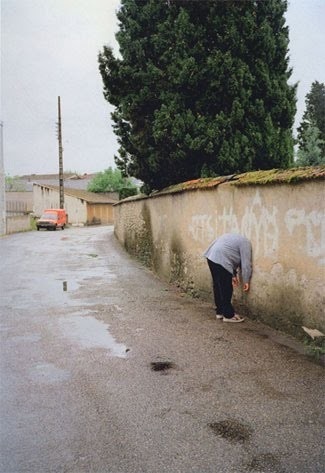
This image by Erwin Wurm is an excellent example of absurd. The subject of the photograph is leaning up against a wall with their head hidden somehow. The curve of the road, gives the image and increased depth of field that draws your eye to the other elements within the background of the photograph. The puddles along the road gives the image another layer, and also gives the image reflection, as you can see a section of the telephone pole has been reflected into the puddle. The placement of the trees within the frame gives the image contrast between the darkness of the green trees and the lightness of all the other elements within the image. The houses and the trees in the far background also increase the depth of field in the left side of the image. Due to the fact that the intended subject of the image, (the man) is waring a lightly coloured top makes him standout within the image and draws the eye of the person looking at the image straight to the man. This image is seen as absurd due to the fact that the their is an almost empty frame just containing one man and one car. Also the fact that the man is leaning with his head through the wall makes the images seem more strange and absurd. I would like to try and replicate the effects of the missing head in order to create a series of images using the hide topic. |
Absurd example - Mark jenkins


|
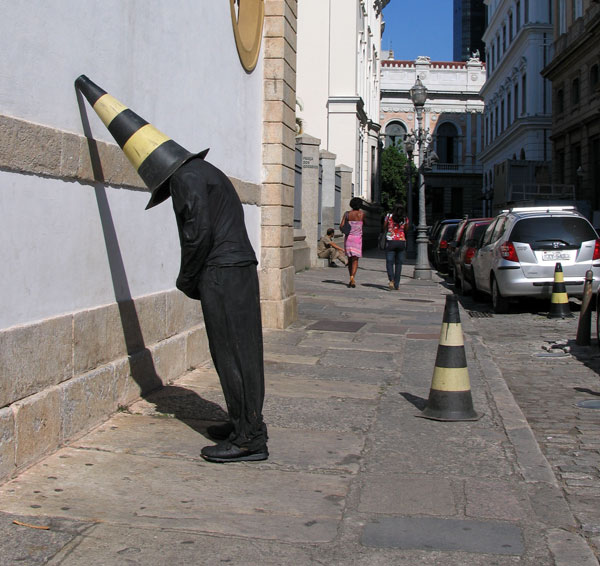
This image is an example of Absurd, the image is by Mark Jenkins. When you first look at the image the primary thing you see is the man waring all black, with a yellow and black cone covering his face, leaning up against a wall. The black clothes being worn by the figure, makes the subject stand put within the image against the white on the black wall behind them. The yellow tones within the cone brings brightness to the subject and to the image, making that segment of the image stand out more than the rest of the image. The fact that there is lots of light in the background of the image gives the image a larger depth of field and draws your eye to the background. Once your eyes get to the background of the image you notice the shadows that are contrasting against the bright light within the background of the image.
This image contains a lot of lines that have been added by the windows and the walls of the buildings. The contrast between the yellow and back on the cones also adds more lines to the image. The cars that are lining up along the sides of the pavement draws attention to the background and also makes the depth of field more noticeable. I would like to use objects that can be used to hide the identity of my subject within my images, this would give me another series of absurd images based on the hide topic. |
|
Experiments #1


These images were not as good as i thought they would be, as only a few of them relate to the theme of hide. This is because we were just starting to understand the project and were just beginning to understand the idea of absurd. To improve these images i could use the images that worked and use the same techniques to do for other images. The last two images i think worked well as they used multiple techniques within them, for example focus, tone texture. all of these elements made the image have an increased depth of field. The images are very similar however i think that they have key differences that make them work well together.
Experiments #2


Evaluation
The images i created all create a very absurd feel, the images all fit together due to the fact that they have the same colour background and there is an overall very neutral tone within the images. The images of the bath is Absurd because the person has their clothes on in the bath. These images also have a high level of contrast within them, as the bath is white and the dress that is being worn is black. The water within the image reflects some of the window and the light shining in. the black dress creates shadow within the water and makes the image more tonal. All of these images contain lots of reflection and also have quite a large depth of field. I included these in my images as these were the key factors within the absurd images i've looked at for inspiration. To improve these images i could focus my experimentation outside rather than inside as this would create a different effect as the background is completely different and would make the images have different elements which would make the images have different variables.
The images i created all create a very absurd feel, the images all fit together due to the fact that they have the same colour background and there is an overall very neutral tone within the images. The images of the bath is Absurd because the person has their clothes on in the bath. These images also have a high level of contrast within them, as the bath is white and the dress that is being worn is black. The water within the image reflects some of the window and the light shining in. the black dress creates shadow within the water and makes the image more tonal. All of these images contain lots of reflection and also have quite a large depth of field. I included these in my images as these were the key factors within the absurd images i've looked at for inspiration. To improve these images i could focus my experimentation outside rather than inside as this would create a different effect as the background is completely different and would make the images have different elements which would make the images have different variables.
Experiments #3


|
Evaluation
WWW: I decided to use lots of different objects around school. The images were created using a range of techniques, for example we used lots of reflection within these images, the reflection helped in multiple ways: it gave the images an increased depth of field, the rain caused a distorted reflection to be created and this further more made the image seem more absurd. |
EBI: I could have taken more images in order to be able to see what techniques work better as well i could have taken more time in framing these images and focusing on the background rather than the foreground. |
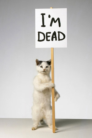
Absurd example: David Shrigley


Signs experiments. |
David Shrigley uses signs to create simple yet very effective absurd images. He uses signs to state obvious or humorous things within the image. For example the Image with the taxidermy cat, holding the sign saying "i'm dead." This is very clear to the viewer, however it stands out more and is made more noticeable and comical due to the sign. All of these images are very simple, they have a plain background, the only things made to stand out are the things that the artist considers important within the image, only the subjects and intended focus of the images are in the image, the background and the other elements within the image are all plain, this makes the key elements within the image stand out more due to the fact that there are no other elements within the image drawing away attention from the main subjects. Each sign within the image, gives a sense of sarcasm which makes the images seem more humorous. I would like to experiment with objects and different types of signs for example; templates, paper or card in order to give different effects within the images. I would like to use objects within my images for example bottles in order to give the signs some context. This will help me to create a series of absurd images based of the signs topic. |


This set of images where taken based on the previous research i had done on David Shrigley, I used hand written signs to state obvious things within the image, i also made signs which would make the images more humorous. I tried to make the images look as simple as i could, using mostly neutral colours, The only things standing out within the images are in colour and the bright sign within each image further more makes the main subject within the image stand out. For one of my images i used A3 Paper to create a simple floor board effect over the orange floor in order to create a more simplistic image. This plain floor was reflected back onto the image. This has allowed me to create a bright image, containing minimal colour. The only colour within the images are the Signs, this allows the images to standout within the image, making the sign the focal point of the image, as the bright colour draws the viewers eyes into that segment of the image.
Homework


Evaluation: These images were taken using an Iphone. I Once again tried to make these images as simple as i could to give them the maximum effect of absurd. These images i have used paper to create the absurd within each image, through signs or drawings. these images worked well due to the fact that the images were all so simple. within the majority of the images there was shadowing, this shadowing caused an increase in the depth of field. The shadowing created line within some of the images which helps to frame the image, and make the image more effective to the viewer of the image. To develop these images i could use sign templates, made by myself to make the images have a more complex look and be more imaginative rather than just stating what is in the photo. However i do think that this type of sign is effective.


This series of images were made using signs which were created on the computer, I made the signs on the computer as they would look more realistic. My favourite image, is the image which has the sign saying ' please do not feed the crocodiles, as this required me to use lots of imagination. I used the people to ply the role of the crocodiles, this added a fictional and absurd effect to the image as, if a sign say "do not feed the crocodiles" you would expect to see crocodiles rather that people.


|
WWW: For these images i tried to add a level of humour to my signs work, I did this by adding characters to my work, for example the stick men. I tried to make these series of signs have a more puzzling effect by making the signs have more ironic,( small written in large writing) this causes the viewer of the image to look twice at the image as the word does not match its description and expected presentation. These images are very simple as they are written on a plain background and the elements within the images are relatively central within the image, there is nothing going on within the image except from the writing or subjects within the images.
|
EBI: I could have taken more time framing the images within the camera as some of these images are off centre which takes away some effect from the images. I also think that some of the images could be more obvious in there purpose, for example what is the purpose of a sign saying "green" but being written in a red pen, however this did help me to gain more humorous ideas for my signs and i would be able to think of more ironic signs that would help me to create more effective images in my future experiments.
|


Absurd example: Laura Williams.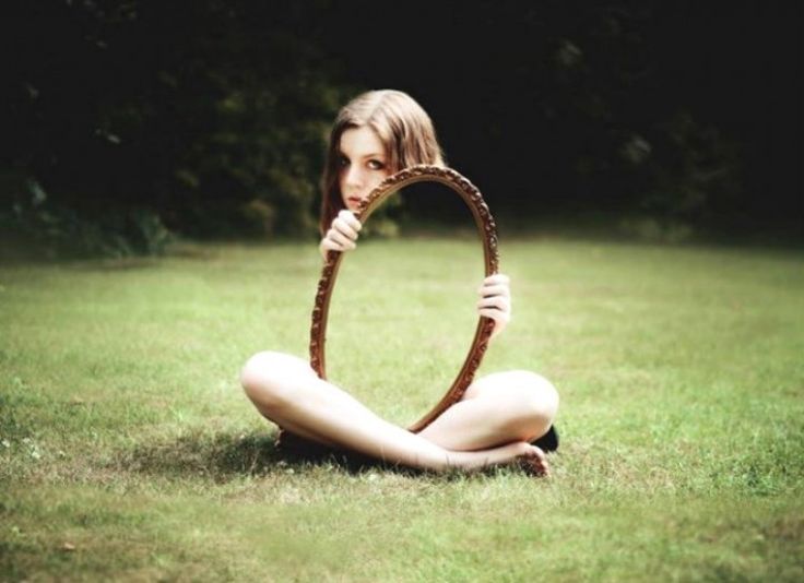
|
Laura Williams uses reflection within her images to trick the eye, and force it to adjust.The use of reflection within the image really drew my eye to the image For this image you really have to take a second look at this image to realise what is really happening. I really like the face that these images are so simple but yet so effective. I like the fact that within this image there is such large contrast, between the paleness of her skin with the shadow and darkness of the trees in the background. I am not sure whether the image being reflective is photoshopped or not, the reason i think this is because the image being reflective aligns with the background perfectly. Using a mirror that is different colour to the surroundings allows the reflection to stand out and give the impression to the eye that the torso of this girl is missing. I would like to replicate the effect of using reflection to create a missing chunk out of an image, i could use photoshop to achieve this. I could also experiment with inserting different images into the reflected space in order to create a series of abstract images based of this piece of research. |
|
This image By Ken Rockwell uses light to create forced perspectives. Once again this image is quite simple however very effective. This image has given me the idea of a series that i could do, which uses a similar concept of the background with a whole which creates the forced perspective. The use of concentrated light within this images creates a large amount of contrast within the image. The main light within this image is central to the image which makes the elements around the light source darker which furthermore causes the light to stand out, emphasising the effect of the forced perspective. The lines that are coming off of the light makes the image have an increased depth of field. I would like to use light as well as some sort of tubing in order to create an absurd series of absurd images through the research on this artist. I could use photoshop in order to create the contrasting effects within the images. |
Absurd example: Ken Rockwell.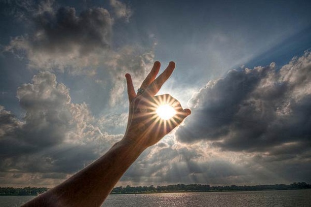
|
Unedited Images


This is a series of raw images, I am going to edit these images using photoshop in order to create the illusion that there is a fragment within the image missing, I would also like to edit the images of the tube in order to create a illusion of separated colours within an image. i will do all of my editing on photo shop. I tried to compose the element within my images in unique ways, for example putting a distinct clear object within the center of the tube, in order to highlight a key element within the image that would eventually draw the eye of the viewer to this point within the image
Edited Images


|
WWW; These images worked well, as they all look absurd and have been edited using photoshop and have made subtle changes to the tube images in order to make the image have more of a forced perspective and to make the image have an absurd effect in the fact that the elements within the centre of the tube are different colours to the elements surrounding the tube, I really think that the image of the person standing in front of the school is really effective as the layered image is very accurately overlapped and gives the full effect of the missing torso of the subject. The reflection of the mirror really blends with the background.
|
EBI; I feel that the image taken using he tubing were not as effective as they could have been i think that this is due to that lack of sunlight as well as the fact that the tubing is quite small i could experiment using larger tubing.
|
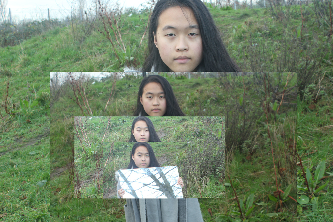
Unedited images


Using a digital camera,I took these images, I used various backgrounds in which would fill the images with line and texture, I am going to use photoshop to edit these images so that multiple versions of a similar image are overlapped onto each other, in order to create a multiple image effect as well as an illusion of a missing fragment within an image. As seen in my research of Laura Williams.
Edited images


WWW: these images worked well as they were made using a range of techniques and processes, for example photoshop, to create these images i used photoshop to layer different images on top of each other to give the abstract reflection. The second image has been framed really well and due to the lines within the images has been given a curved effect. The first image has also got lots of lines within it.
EBI : To improve these images i would like to re take the first image so that it is framed better, To develop these images i could take the images in different places, for example in the studio, i could also add an effect to the images for example black and white.
EBI : To improve these images i would like to re take the first image so that it is framed better, To develop these images i could take the images in different places, for example in the studio, i could also add an effect to the images for example black and white.


|
WWW: These images were very simple however they were also quite effective, there was no distraction within the image meaning that all the focus would be on the subject of the images. Using the different facial expressions gave the images a comedic effect, having the plain background means that you are able to see the tones within the images. The subject of each image is generally central within the image which further more increases the simplicity of the images. These images all have a range of tones and textures within the images.
|
EBI: I feel that these images would look a lot better with some type of pattern or element in the background as it give the image more character and makes it more interesting. As a result of this experiment, I am going to go back to taking images outside with a background. Out of these sets of image i prefer the images that are in black and white, this is because you can see the individual contrast between the tones of each layer of the image without the change in actual colour. To improve these images i could make the images more interesting by changing the poses that the subjects are in.
|
|
WWW: In my opinion this image worked well as they are abstract and are made using techniques for example photoshop. The background of this image has lots of texture from the woodland, which contrasts with the softness of the subject in the foreground. The woodland in the background adds lines and images into the photograph.The subject is in the centre of the image and is looking directly into the camera, this emphasises the connection that the viewer and the subject of the image have. EBI: I could try to add an effect to the image such as black and white as this would add tonal contrast as well as adding a colour contrast within the image. |
Final piece


WWW: I edited these two images to a black and white effect on Iphoto in an attempt to increase the tonal contrast. I think that these images work better as the black and white effects increases the tones and textures within the images. Both of the images are well framed, and all of the elements within the image have been placed and photographed well. I am going to use these images as my final piece due to the fact that when ever i try to develop these images the outcome is not as good as these images. I think that these images work well together as they are quite similar however are also quite different. These images were influenced by the research done on Laura Williams, These images are developed from the immediate experiments i completed after the research. I used photoshop in order to create and layer each image over each other.
EBI- I would have liked to make the fragments of the images smoother, in order to make the image look less artificial, and more natural.
EBI- I would have liked to make the fragments of the images smoother, in order to make the image look less artificial, and more natural.
Final Evaluation
During this project i have researched multiple artists in order to gain inspiration for the different subtopics of this project and as well to gain a better understanding of the topic as a whole. I have researched Erwin Wurm and Mark Jenkins to help me to gain inspiration as well as understanding of the hide section of Absurd, this research lead me to complete multiple experimentations on hide however i feel that this was my weakest subtopic and i decided after three experiments to move on from hide and go onto the signs topic. I immediately had a good understanding of the topic and was able to successfully create and develop multiple experimentations on the signs topic. During this signs subtopic i experimented with using hand written signs, on postcards and i also used photoshop to create templates which i used in my photographs to give the signs a more professional and official, which made the images seem like they would occur in a real life situation, this made the image seem more absurd. I then researched Laura Williams who gave me inspiration to use reflection within my images to give them an absurd effect, This lead onto me using ; photoshop and iphoto in order to layer multiple images on top of the reflection in the mirror, at first i reflected an image of the background in order to give the effect that the subject had some sort of hole in their torso, as the background that they were covering could be seen through them. I then decided to layer a smaller version of the same image over the reflection which was the most effective. I also researched Ken Rockwell who inspired me to use light and colour to change the perspective of the image. I decided to use a cardboard tube to focus on a point surrounded my the remainder of the setting, i then made the section of the image that was not in the tube in a black and white effect and the segment of the image that was encased in the film a strong dominant colour, this made the two segments seem separated.
I then was researching to find these artists on Pinterest i was able to gain an initial understanding of the absurd topic. My first view of the topic was that it was a topic that has such a broad range of subtopics and experimentations that i would be able to complete during this topic, however i was kind of clueless as there was so much to do that i had no idea where to start. I used Pinterest to find subtopics that interested me and that i felt i would be able to complete well. I found that reflection and signs were the most effective subtopics for me as i was confident in my experiments and was able to constantly think of new developments that would make my experiments better. These are the two topics that i completed the most experiments and developments on. I made a final piece for the Reflection topic and for the signs topic as these subtopics created the best outcomes over the rest of the subtopics. This topic made me become more adventurous with my experimentation however this is what was needed in order to create the most effective images.
I tried to use a range of media techniques when photographing and developing my images, for example i used my mobile phone and a digital camera to take the images and i used photoshop and iphoto when editing my images. This was due to the fact that i was able to make basic images that were slightly strange into an image that was very absurd and that was unique to any image that i would create in another topic. I felt that it was necessary to think outside of the box as the weirder and more adventurous the experiment the more developments that were able take place to lead up to the final result. At times it was very difficult to find inspirations and there were a couple of times that i had to move on to a new subtopic in order to progress, or i would have to do some more research in order to gain some more inspiration. When moving on to a new series within my topic i tried to use a different technology in order to increase my range of technology within the project.
I feel that the experimentation between each subtopic caused my final outcome to be more successful, I think that i found the process of coming up with new ideas to use was quite challenging as it caused me to really think outside the box and to step outside my comfort zones in order to create successful images. Within all of my experimentation, reflection was a common theme within my work, through out the topic, I used some reflection within my hide subtopic and then continued to use this within the other subtopics, I then chose to work on a subtopic purely based on reflection which i then used as my final piece. However i changed the different types of technology i used when working on the reflection subtopic, for example i decided to focus on the effect of missing space by filling in the reflective surface with the image that should be in the background, eg: the school building. I then changed to filling the image with a smaller version in order to create a different effect.
At the end of this Project i feel like i have been successful as i feel like i have explored a large range and lots of different sections of this topic and have experimented with a range of ideas that seemed to link together. I was able to take inspiration from multiple subtopics to help inspire my final piece.
