Abstraction
Introduction
|
Abstraction~ using the formal elements: focus, line, shape,tone,colour to create a unique sensation that you would not come across when creating a natural photograph.
Abstract photographs do not have a subject, they focus on other elements within the images. The subjects are discarded in a way to focus on the more unusual images within the photograph. FOCUS: Nowhere in these images is focused.
LIGHT:The top and bottom of this image have the most light, this draws you into the center of the image. LINE AND SHAPE; There are not any defined shapes in this image, but there are clear lines all over the image, on the sides top and bottom of this image. All of the lines go in different directions, vertically either side, and the lines at the top and bottom of the image are going towards the center of the image, once again drawing you in to the center of the image. REPETITION; The only pattern in this image are the lines which make a room like feel within the image. SPACE; There is lots of space in this image which adds light to the image. TEXTURE; Lines in this image create a lot of texture in this image. TONE; There are lots of different tones in this image, on the right side of the image there are red and orange soft tones, were as on the left there are black harsh tones which counter balance each other; creating a neutral texturised image. |
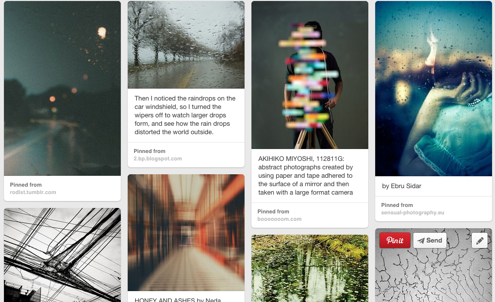
Matthew Tischler : When looking through Pinterest i came across a set of images that really took my interest, The set of images what 'The screen series' by photographer Matthew Tischler. Matthew Tischler is a new york- based photographer. Tischler earned a BA (a bachelor of arts award) as an undergraduate at Sarah Lawrence collage. Tischler used window nets and other netting to create these images. He makes sure that the subjects remain faceless and without and detailed features they just act as another texture and colour within Tischlers images. "None of the subjects in my photographs have any discernible features." 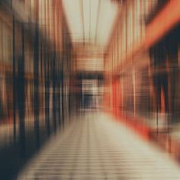
|
How to improve these images
This is the group of images i would like to develop, I took these images with the inspiration of Matthew Tischler. These were not the images i wanted to take but i didn't have a model to do what i wanted to do so i took these in replacement.
To develop these images i would like to take images out side in the local park with my model waring colourful jumpers, i would also like a thicker mesh print so that less of the background shows through the mesh and so that the background is out of focus but the foreground is in focus. In this set of images i am going to use colour, texture and line in my images as they are the formal elements that Matthew Tischler uses in his work. I would also like to add more light in the images. I would like to take images in different locations so that the background, even though it is out of focus, still look individual even though they are very similar. Paul Strand image evaluation This images of Paul strands abstraction series is the image that most stands out to me and is the most abstract in my opinion. I am drawn to this image because of all the shadows and lines created in this image. The direction of the lines contrast against each other creating an angle at the point that they meet. I also really like this image because because it is in black and white and the lines of the shadows against the white and grey of the walls. I really like the fact that the two shadows are different tones as this creates more texture within the photograph. I think this image has been well composed as all the elements within the image have been placed and the image has been timed perfectly, at the right time of day so that the shadow on the wall is at its darkest but not too early that the shadow on the table is as dark as the shadow on the wall. My themes and focuses.
I am focussing on lines and focus as i feel this could have a very abstract outcome. i feel that these images represent my themes and all have lines included in them and some are in focus and some are out of focus. I am incorporating two themes as i feel that these themes compliment each other perfectly. in some images i am going to incorporate texture but that will not be a recurring theme in all of my image To develop these images i am going to take images out side of school so that i have more new space to experiment and find ideal photographic settings and object to take my images in. I am also going to plan my images carefully in future so that i can achieve the simple but effect look i am aiming to get. |
HOMEWORK - 2/12/14
In this set of images i used items that i found around the house and used different parts of the items i found to create abstract images. My favourite of this set of images are the colourful straw ones as they have a really abstract effect and have different textures, tones, lines and colours which makes the photographs stand out above the rest. I took 2 images of the straws one in focus and one out of focus to add more abstraction and see which image created the best effect. in my opinion i prefer the image that is in focus due to the fact that there is much more texture created as a ring shape is created around the tops of the straws. The image i like the least was the last image as it was off center, it has a little bit of wall showing, which ruins the image and makes the image lose its effect. I would display these images in groups as there are a few images in these 20 images that would go well in a series together, and i would like to develop further.     Paul Strand: abstraction, Twin Lakes, connecticut. (1916)
Paul strand uses lots of lines in his photographs he also uses lots of shadows in his work to create more lines within his photographs. In the majority of his images he uses furniture. He uses every day objects and captures the images on a sunny day so that the shadows are dark and highly visible and he can get the most effective shadow possible. Paul began taking photographs as a hobby but later in life he was convinced to move his photography career forward and start to take photographs professionally, after going to a exhibition showing the work of Edward Steichen at school. Paul had a full time career as a film maker but his photography took over. Paul Strand uses different effects and tones and other formal elements in his photography. 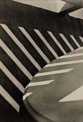
|
Experiments in school |
These images all suit my specific abstraction theme. All of these images have some sort of line within the image and are either in or out of focus. To improve and develop my images i could add an effect, using an app or later on when uploading my images, to a separate set of images, and maybe do what i did in one of my images were i had the centre of the image in focus and everything else out of focus. i liked this as it added more texture and made the image more abstract. In this experiment i took lots of risks and was very adventurous. For each image i used a different style and made each image individual so that i could see which i liked and develop it from there. |
In my next set of images i am going to choose the 2 images i like and try and replicate the effect with other objects in another surrounding to get a strong understanding of exactly how to produce this effect within the original image. In addition to develop my images further i will try to make the lines more subtle and harder to find as i feel this will make my images more compelling to the viewer and to myself as i would like to try and add these formal elements along with some extra to create a very appealing image with unusual effects that creates an atypical feeling when you look at the image. I feel that the image highlighted 'this image' best represents the type of image i am aiming for.
|
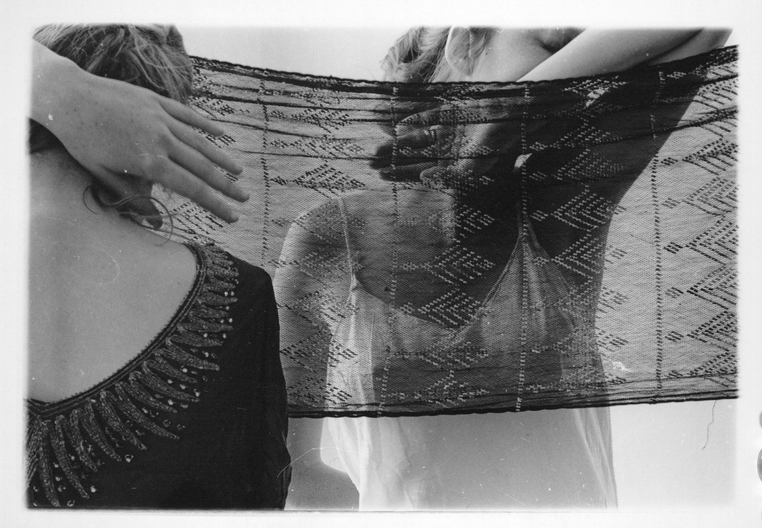
Francesca Woodman
In this series of images Francesca woodman focuses on line, specifically zigzags. Each photo in her series " ZigZag' contains some type of ZigZag. In her images she often uses deserted interior rooms and her body blends into the surrounding. Francesca woodman always carefully composes her images in intense detail. She carefully places herself Camera and/or a model to create the ideal image she wants. She composes her images all very differently. All of her images are very different but all share one similarity. ZigZags. Some of Francesca Woodman's images are very simple but you can see they have lots of meaning behind them. This image is my favourite image of Francesca Woodman's as it is the most unique compared to all the rest and it caught my eye with all of the textured fabric, the fabric creates lots of tones within the image and the two subjects create a mirrored effect, even though the two subjects are holding different poses and are waring different items of clothing, because we can only see the back of the nearest figure and the front of the second figure it makes a whole figure, filling in the missing sides of each other. |
|
Home Experiments.
|
|
When taking these images i focused on line and focus, i feel that these two formal elements go well together and if you compose your photograph accurately and plan what you are going to do then the out come can be spectacular. I feel i successfully created 13 images that portray focus and line. These images were taken of every day objects you might find in you house but from a different angle that makes them unrecognisable unless you were told what they were. I composed the elements within the images carefully and made sure that everything was just the way i wanted them to be before i took these images. i then uploaded them to my computer and using a basic photo editing app added a black and white effect to most of the images. I could have improved by not cropping ANY of my images as i did crop one which was not composed the way i thought it was to i just adjusted it slightly. If i was to take that image again i would use the same objects buy just make the camera angle different. I added a black and white theme as i feel these images gained more emotion and were exaggerated more in black and white, which helped bring out the detail within the image. In a few of my images I increased the depth of field and focused on the object in the foreground to make the background lack focus and add more movement to the image. To improve for my next set of images i would like to focus more on the back ground and less on the foreground to capture a similar style image that looks completely different. I may also like to add a different effect as i would like each series of images to be individual and later on if i fell like it would suit a black and white effect also i can easily change my mind, but i want to experiment with all my possibilities so that i can judge what i like and what i don't like and go from there, only using the styles of photography i like and i feel give me an effect and fully successful set of final pieces that i am confident and happy with.
|
36 images
|
Evaluation
These images were taken outside of school in a variety of different places, some in a train station, some in blackheath and some at home. I used an Iphone 4 to take these images and then i edited them on two different apps. The main app i used was called filtery which added an effect to the images. The main effect i used was black and white. I also used some slightly different effects that gave the images a yellow and brown effect. I also used another app called fragments which takes part of an image and separates it from the original images so that i can move and adjust the image to add/ duplicate the subject of the photo many times and i can also rotate and move the image so that it is in a completely different place. With the Fragments app it takes a lot of practice and i am still getting used to the app which means it will take a while for me to come out with perfectly edited images. I think i successfully managed to take a series of images that followed my theme of line and focus. I chose line and focus because i thought that the combination of the two formal elements go well together and give the artist a range and freedom to plan images as there are lines all around us and whether focused or unfocused the lines are just furthermore exaggerated. To develop these images i am going to take images in open spaces like i did in blackheath but more, with the silhouette of the building but still being able to see some detail in the building, as i like the way this image looks and i am going to use the fragment app to make this images have a more abstract look to them. 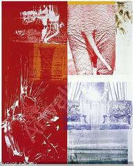
|
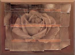
Inspiration research. I started to look at images of abstraction photographs using fractions. I found 2 different artists that use fractions in different ways. I found a book called 'Robert Rauschenberg.' by Sam hunter. Robert Rauschenberg who takes fragments of images, changes their colour to something bright and extravagant and then puts together in one image all of the different fragments, creating a masterpiece of colour, line focus, texture and space. I could use paint stamps in different paint colours and images/ patterns to create contrast and texture through a style of my own. I also found in the book, 'flora photographia,' by william A. Ewing, Starn Twins, with the image Rose. They take images and prints them out. They then roughly cut them out and stick the segments back together. I assume that they print the image twice but the second has been edited and given a lighter effect. and when stuck back in the correct place (roughly ) the new image has multiple tones and colour in it. I like the fact that the image now has lots of lines in it where the segments have been stuck together. I could do this with a selection of my own images by printing out two of the same image, one in colour and one in black and white or another effect of my choice and then cutting them out and sticking them together mixing the black and white with the colour. |
|
|
I have put these images into groups of images that i think go well together and could be used in a final pieces or their own series together. I am happy with the groups they are in as they all greatly compliment each other and help emphasise the focus and lines within each of the images. I tried to put the photographs in groups with the same effects and colours in, also the ones that have similar themes and subjects so that the images look less out of place in their groups, there were a few that i struggled to place with other images because they have odd/ different tones and elements within the photograph. |
Experiments on fragments app
|
I took these images as a base for the development i would like to do, I would like to use the idea i got from the 'flora photographia' which had some work by the Starn Twins, I would like to use these images to create a picture through the technique of printing and fragmenting the images together by hand, I would also like to try and use photoshop and the fragments app to create this effect, this would show that i can use multiple photo editing techniques and methods. I am also going to use these images to create the other inspiration research i did from 'Robert Rauschenberg' i would like to put multiple images together in a collage and have different sections as different colours. |


I think my first experiment with the Fragments app was successful as i gained some experience with the app and also i created multiple images that i could use as a final piece. To develop this is could do another experiment with the app, following a specific theme of photography, such as scenery. I also think that i should use more extravagant edits and be more risky with my experiments.
Final pieces
Final piece 2


This final piece i an going to stick them to foam board, i would not like to go over the top on the displaying of these images as the images themselves have very extravagant edits there fore if i did a big display then the display would over power the images and they would not be as effective as they are without a big display. I think that these images compliment eachother and bring out the individuality of the edits and also make their different colours stand out.
Final piece 3


This is my third final piece and i would like to display this by folding the images like a fan and then attaching them to a bit of string with a peg. The image in the middle, i am going to crop to the same size as the other two, they are going to be printed in A5 so that they are not to big and so that they can easily be cropped to the same sizes if they are slightly different.
Final Evaluation
Since the start of this project i have enjoyed every aspect of the work, the research, the photography, and the editing and final development of the 3 final pieces. To start my project i did some research of various artists that focused on abstraction, secondly i researched what abstraction was, to give me a better understanding of what i was trying to achieve within the abstraction theme.
I did research on :
I most enjoyed looking at the work of the Starn twins, that i found when doing my book research in the book 'flora photographia' which gave me my inspiration for my first final piece.after the initial research I had lots and lots of ideas on what i could do to incorporate her work into my own in a subtle yet effective way. I managed to achieve success through using fragments, but instead of using uneven roughly cut and replaced back together, carefully and accurately measured each fragment to the same size, i also did this with the same photograph with a different effect, for example back and white. When placing my fragments i alternated between the original image and the edited image to create a check board like effect. In between each fragment was a white boarder, this gave the image a more textured puzzle effect. This helped my achieve my goal of using two formal elements, in my case i used line and focus, each formal element complimented this final image perfectly, there were more lines added my the fragments and also there were lots of lines in the images i used. The focus was tricky but when the final image of the mixed fragments were put together some of the fragments had different focuses which added more texture and space within the image.
As well as experimenting with the research, i also experimented with apps. I experimented with an app called Fragments which i purchased on the app store for the purpose of this project. I did multiple experiments with image i had taken across a number of days. I really wanted to see what the app had to offer towards his project, as a result i ended up with multiple images i felt were perfect for this project, so i decided to develop those images . I went out and took more images, carefully i edited them through the app to create my ideal images for this project. I decided to use two of that series of images as a final piece.
My initial research was on Matthew Tischler, who i found on pinterest at the beginingof this project, which i was really drawn to due to the bold colours and the lack of focus, i only did one or two experiments with his work but i would really like to go back to it later on in the year and develop it furthur even if it is in another project, i don't think his work as achievable at this time of year due to the lack of greenery and other plant life that would give the image more colour.
I did research on :
- Matthew Tischler
- Paul Strand
- Francesca Woodman
- Robert Rauschenberg
- Starn Twins
I most enjoyed looking at the work of the Starn twins, that i found when doing my book research in the book 'flora photographia' which gave me my inspiration for my first final piece.after the initial research I had lots and lots of ideas on what i could do to incorporate her work into my own in a subtle yet effective way. I managed to achieve success through using fragments, but instead of using uneven roughly cut and replaced back together, carefully and accurately measured each fragment to the same size, i also did this with the same photograph with a different effect, for example back and white. When placing my fragments i alternated between the original image and the edited image to create a check board like effect. In between each fragment was a white boarder, this gave the image a more textured puzzle effect. This helped my achieve my goal of using two formal elements, in my case i used line and focus, each formal element complimented this final image perfectly, there were more lines added my the fragments and also there were lots of lines in the images i used. The focus was tricky but when the final image of the mixed fragments were put together some of the fragments had different focuses which added more texture and space within the image.
As well as experimenting with the research, i also experimented with apps. I experimented with an app called Fragments which i purchased on the app store for the purpose of this project. I did multiple experiments with image i had taken across a number of days. I really wanted to see what the app had to offer towards his project, as a result i ended up with multiple images i felt were perfect for this project, so i decided to develop those images . I went out and took more images, carefully i edited them through the app to create my ideal images for this project. I decided to use two of that series of images as a final piece.
My initial research was on Matthew Tischler, who i found on pinterest at the beginingof this project, which i was really drawn to due to the bold colours and the lack of focus, i only did one or two experiments with his work but i would really like to go back to it later on in the year and develop it furthur even if it is in another project, i don't think his work as achievable at this time of year due to the lack of greenery and other plant life that would give the image more colour.
