|
MARTHA COOPER
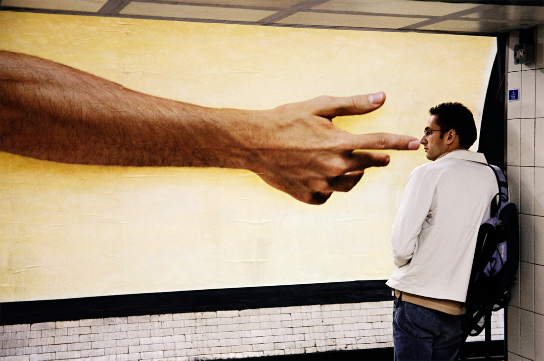
Martha cooper is a photojournalist born in baltimore in the 1940's. Martha takes pictures of 'art in the streets' so pictures of hip hop and graffiti that she sees when she is walking around the streets. Her love for photography began aged three when her father gave her a camera and they went out in the streets looking for photographs. "yeah my father used to take me out and we would just take pictures. That's what i thought photography was... we were just looking for pictures." 60 years later Martha cooper is still on the streets with her camera looking for pictures to take. In march 2013 many graffiti artists gathered to make a tribute for cooper for her 70th birthday. This tribute is on huston street for every one to see. |
EVERYBODY STREET PHOTOGRAPHY.
This everybody street film highlights the life of average people in the streets through the work of many street photographers that go out and capture these creative yet natural images. This video pays a tribute to the street photographers through a cinematic exploration of street photography in new york city. Everybody street shows a number of street photographers that have never been documented such as: Bruce Davidso Elliot Erwitt, jill freedman Bruce Gilden, joel meyerowitz, Rebecca Lepkoff, Mary Ellen mark, Jeff Mermestein, Clayton Patterson, Ricky Powell, Jamel Shabazz, Martha cooper, and Boogie, with historians Max Kozloff and Luc Sante. |
|
EVALUATION OF A MARTHA COOPER IMAGE
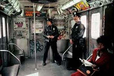
n this photo there is two police men they are in identical uniforms but they are standing separately one of them i looking into the camera and one is looking away, also there is a woman in the bottom right hand corner of the image this is because she is closer to the camera and you can clearly see the whites of her eyes looking straight at the camera so it looks like she is looking at you, this makes you feel like you have a connection with her. In this image there are allot of lines, on the seats, the pole in the center, the door and the light on the floor by the pole. The police on the train helps us have an idea about the context. public safety, this is shown by showing the police on public transport. The composition of this image is good as you can see the light from the windows on either side of the image looking in on the subject, also because there is a pole in the middle separating the left side from the right causing an effect in a photograph. |

least effective
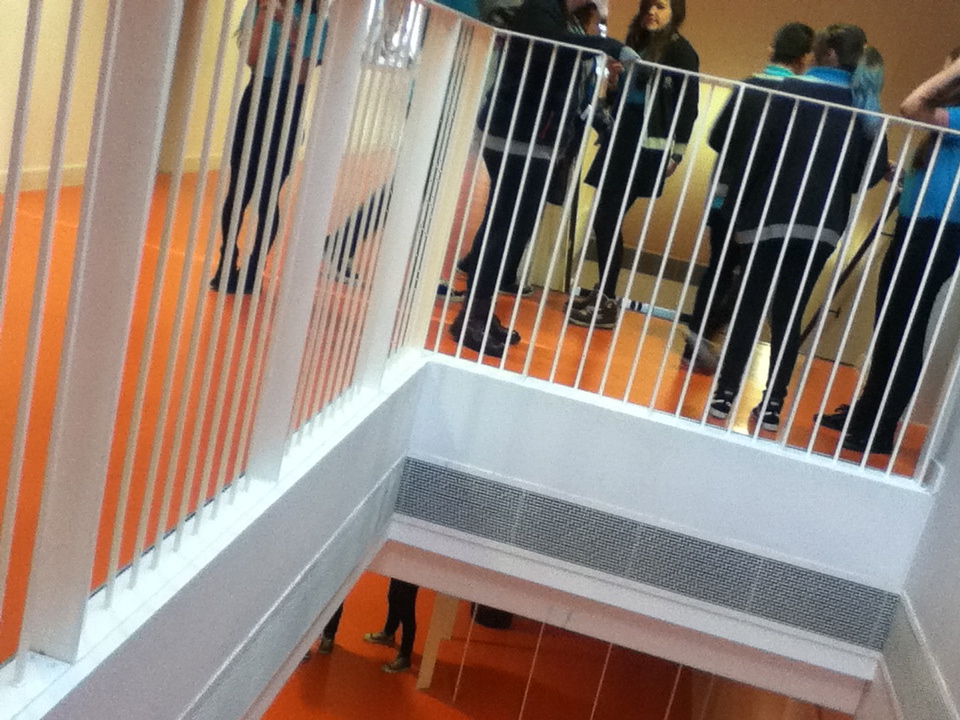
I think this photograph was one of the least effective as the composition of this image was not thought out. also this photo has no context. In this photograph there is no main subject, some people could say that the blonde girl at the back is the main subject. The depth of field in this photo in very short and narrow giving the photo a small effect. this make it look over packed and cluttered. The foreground of this image is blurry and it gives the photograph a strange texture. There is quite allot of lines, i think that is the only good this about this image. |
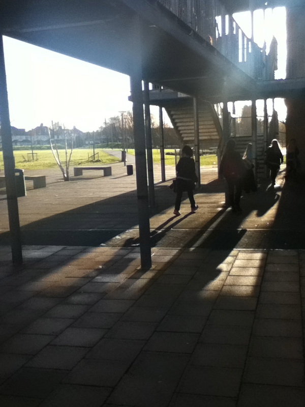
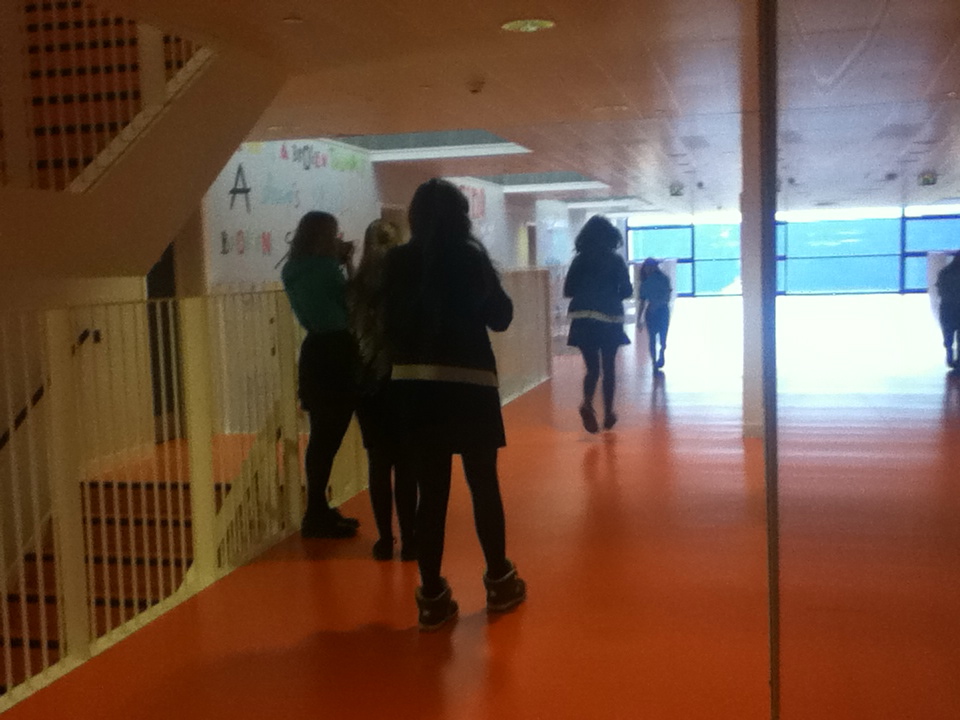
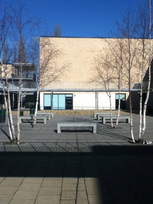
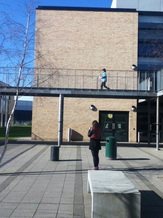
Best photograph.
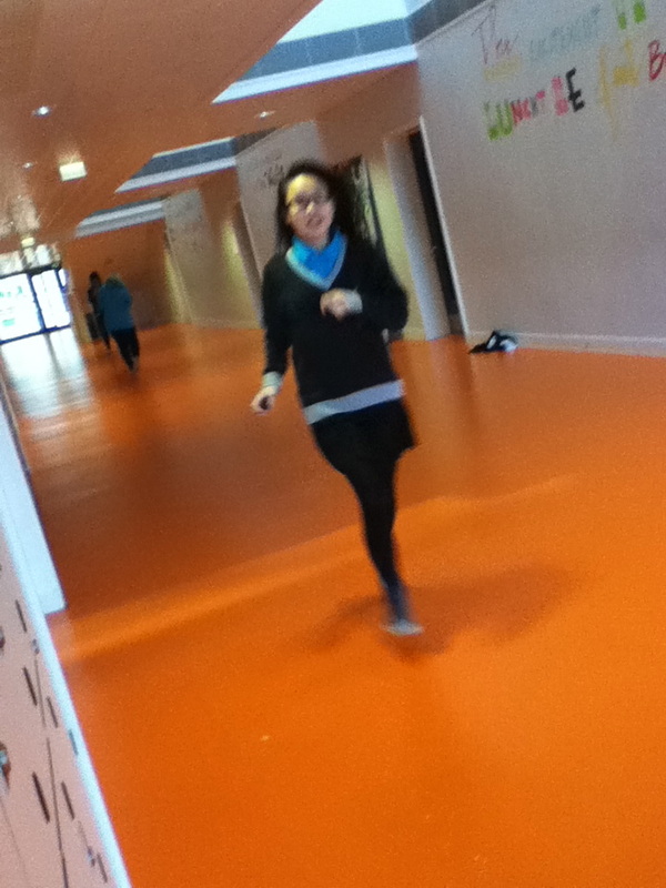
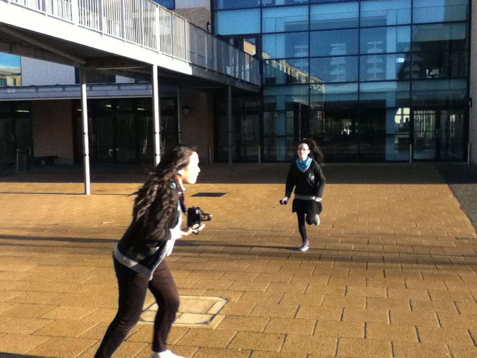
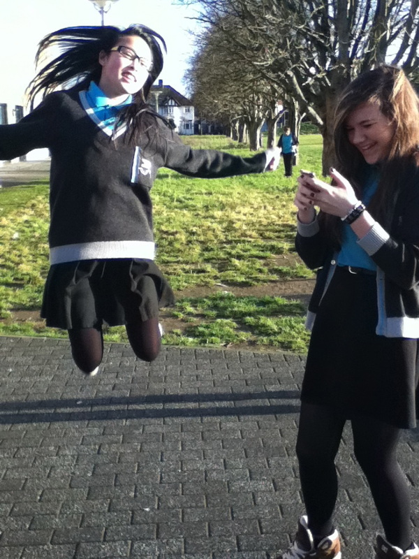
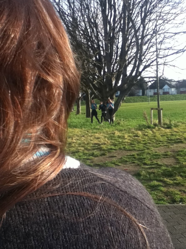
I think this is my most effective photograph because there is allot of lines in the fore ground and the back ground. the person in the fore ground is just off central within the composition. There is a big contrast in this photograph between the metal bridge and the glass on the building. The image is in color. The main focus of this photograph is the two girls running. the context of this image people rushing. i think it expresses the school life because people are running around because they are late for lessons. There is a deep depth of field as you can see quite deep into the background if you look into the glass you can see into the office. 
|
Why do street photographers use cropping and shadows?
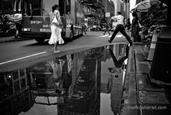
Most Street photographers use shadowing and cropping to create a range of different effects. cropping is not editing something out of the photograph after the picture has been taken. cropping is, for example is showing half of someone or only showing one part of someone or something. I think this image shows cropping quite well as you can only see parts of the people also reflection has been used. if you look you can see their reflections in the water, this gives the image effect as you can see in the picture above taken by Markus Hartel. |
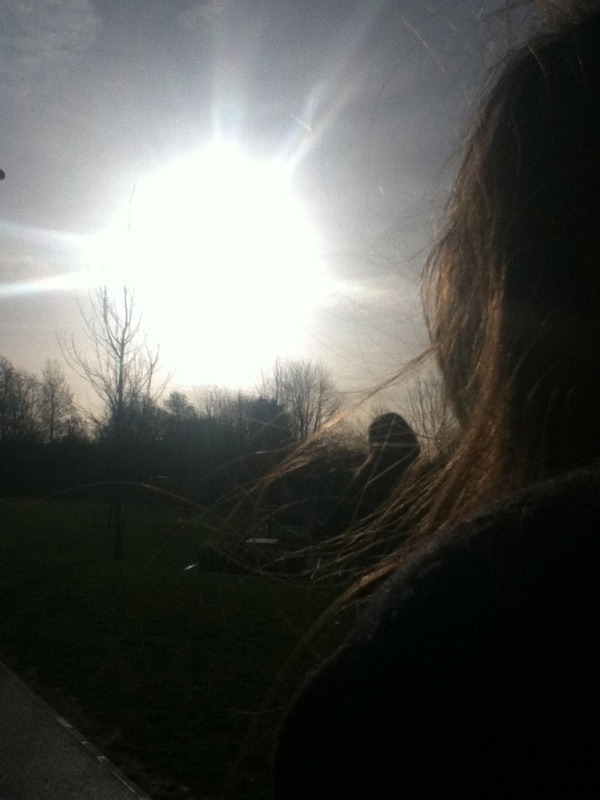

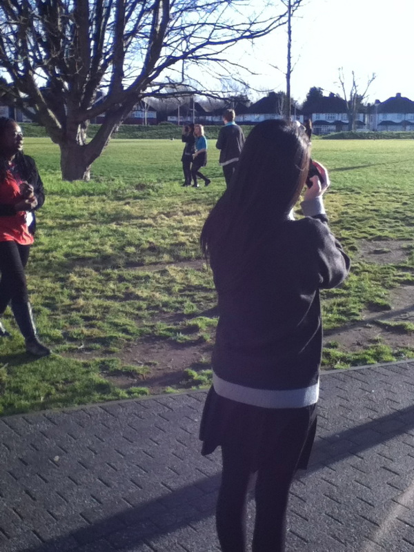
Over the shoulder.
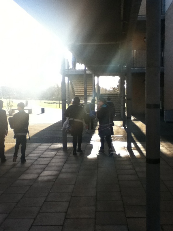
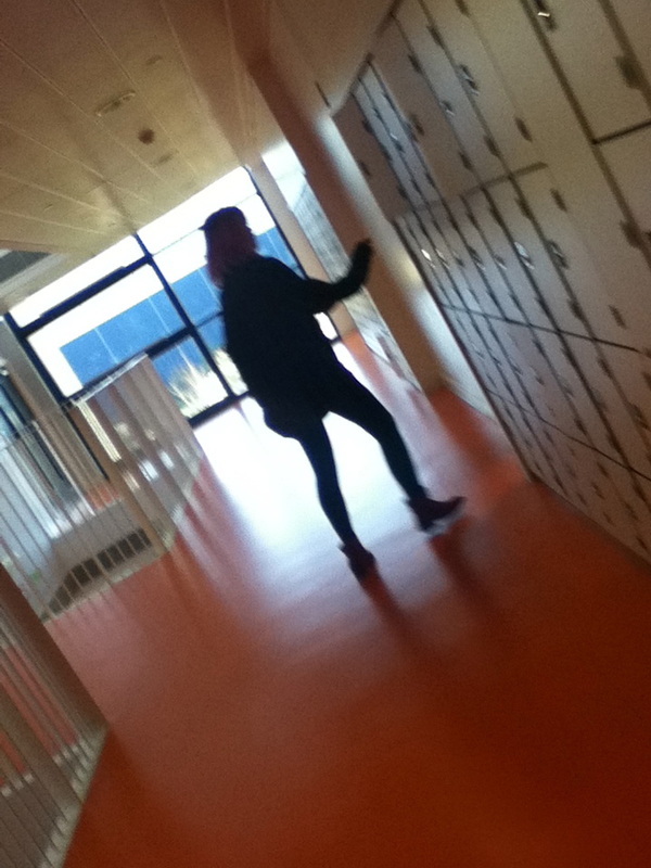
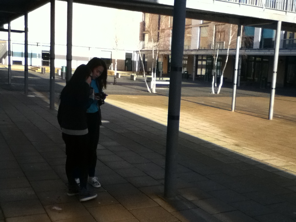
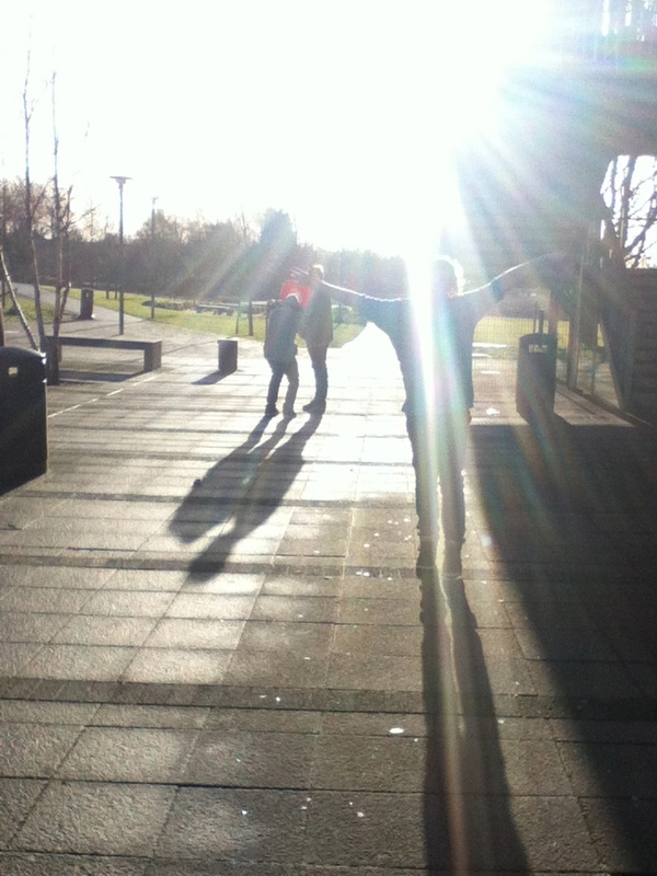
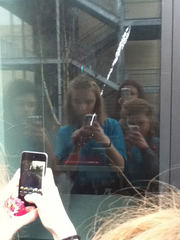
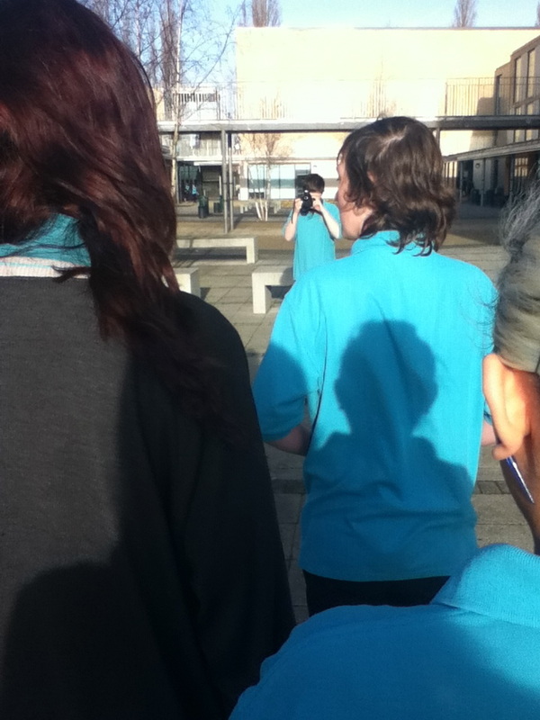
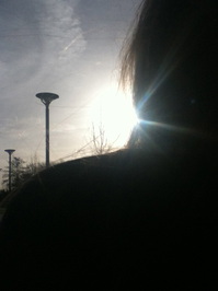
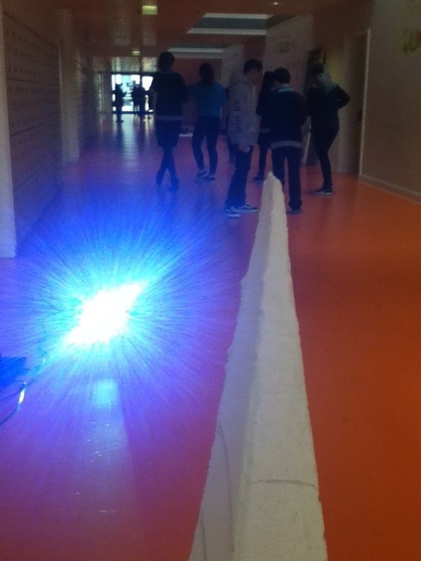
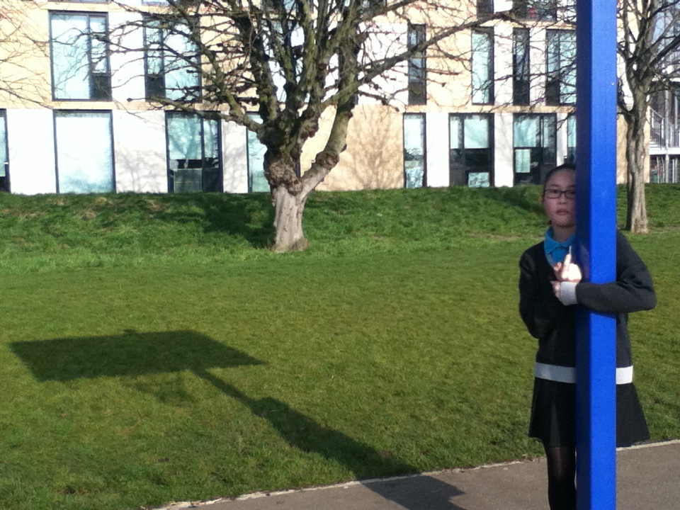
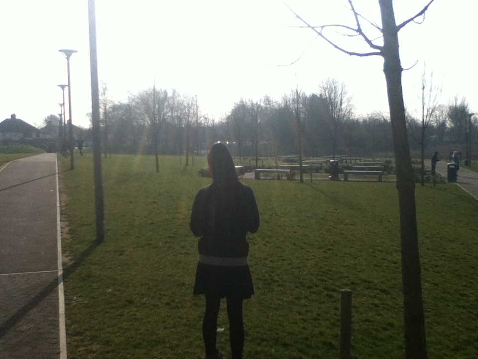
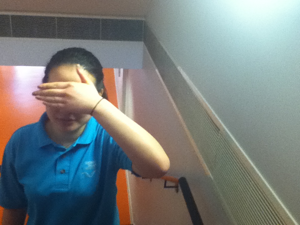
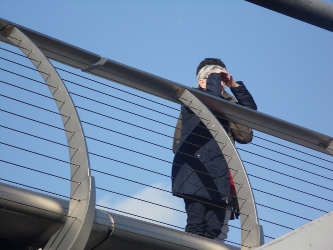
This is one of my over the shoulder shots, I like this one as you can see the glare of the sun which adds lines to the photograph. and also you it looks like there are three sun rays on the neck. I think this is one of my best images as the person looks like a silhouette because the sun is shining in to the camera lens. There is a figure of a shoulder head and neck close to the camera, you have the lines in the sky from the clouds, two lamposts to the left of the sun, i think this is one of my favourite images as you have a lot of lines in the background the street lamps the clouds in the sky and the trees and the. I think that i made the right decicion by using the ipod to take this photo and not the digital camera because if i used the digital camera i may not have got the effect of the sun which makes this image really good and have a nice effect on the eye.
This is one of my over the shoulder shots, I like this one as you can see the glare of the sun which adds lines to the photograph. and also you it looks like there are three sun rays on the neck. I think this is one of my best images as the person looks like a silhouette because the sun is shining in to the camera lens. There is a figure of a shoulder head and neck close to the camera, you have the lines in the sky from the clouds, two lamposts to the left of the sun, i think this is one of my favourite images as you have a lot of lines in the background the street lamps the clouds in the sky and the trees and the. I think that i made the right decicion by using the ipod to take this photo and not the digital camera because if i used the digital camera i may not have got the effect of the sun which makes this image really good and have a nice effect on the eye.
My own street photography images
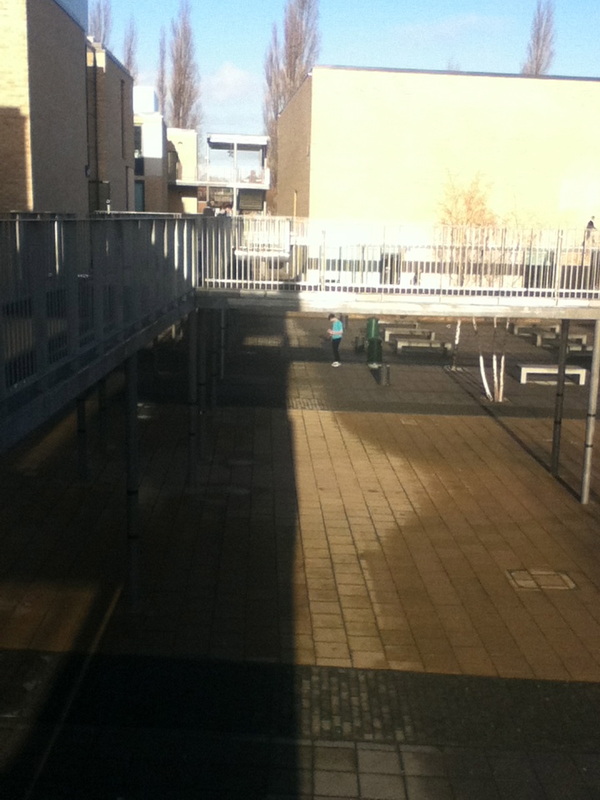
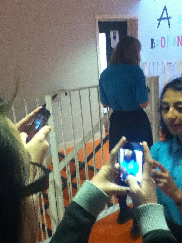
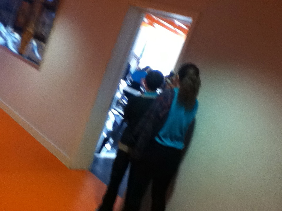
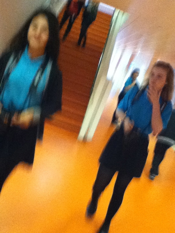
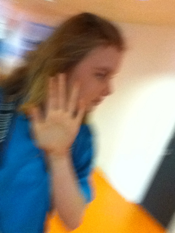
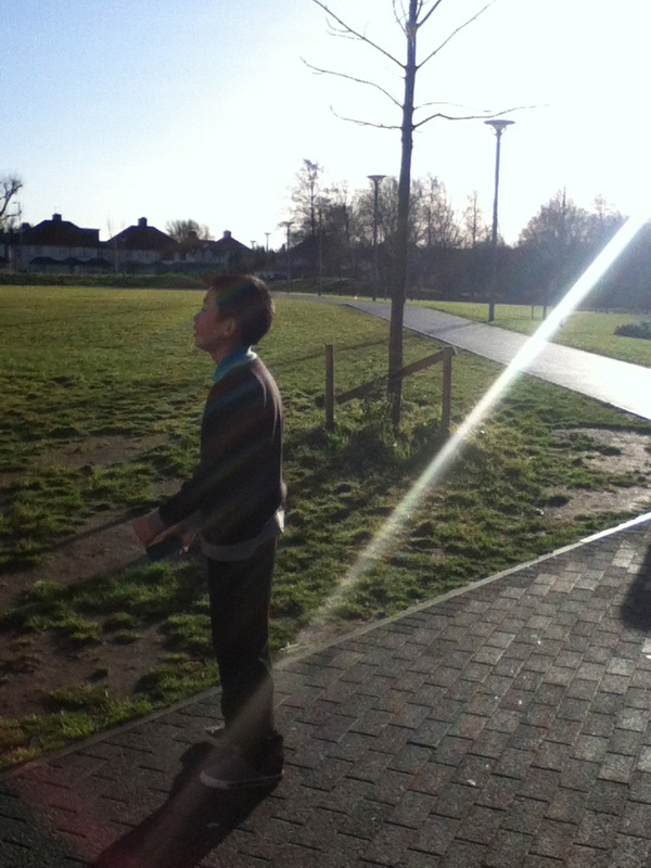
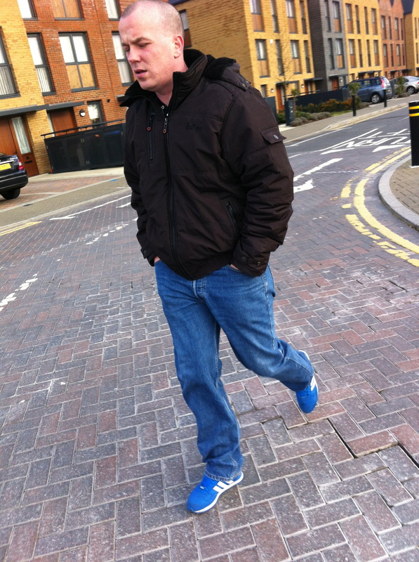
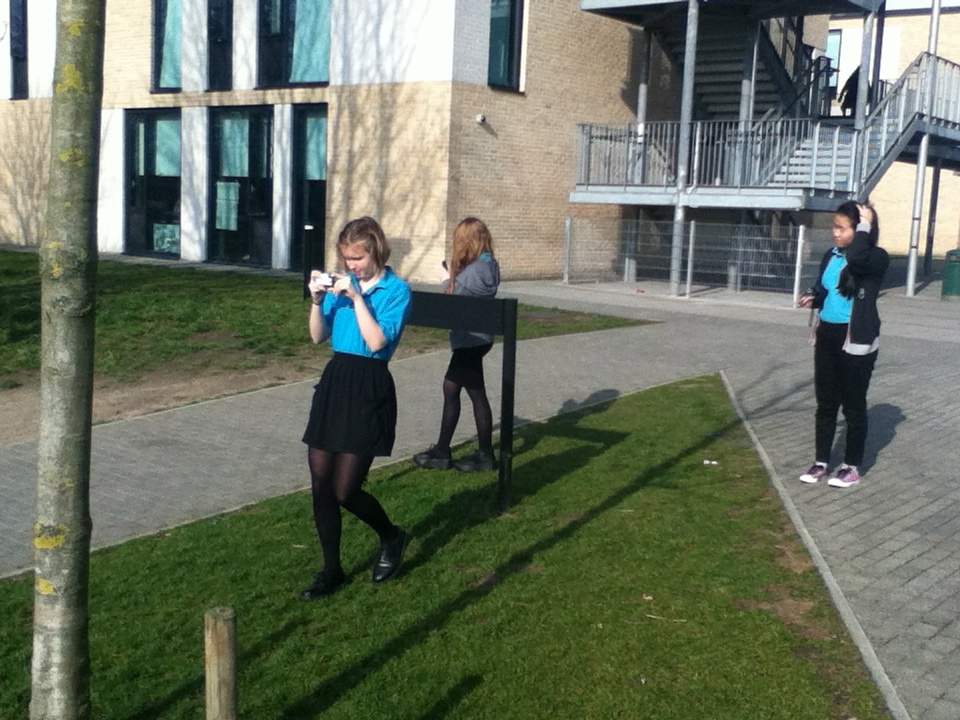
The next set of images were taken by me in a street photography style, this was the first time taking photographs like this. I was working independently so i had no influences from friends, that means that these images are completely my own also we was able to go into the sixth form classes and capture images of them, for me i found this really awkward as we would have to take close up images of people we do not really know, but i still tried to do it as it would give me an accurate in site into how street photographers such as Jeff Mermestien work, as they go right us into peoples faces without any nerve and just snap photos of them. Before we did these images we watched 20 minutes of the street photography video and watching other street photographers they make it look so easy it really was not that easy, but they do have many years of experience behind them. our task was to take 10 images independently. after just watching how boogie done his work i kept in mind that 'taking a photograph does not make you a participant, you are just an observer.'
6 themes
SurfacesWere ever you look you see all different textures. on the walls, on the floor, trees, benches the list is endless everything you see or come into contact with has a surface. Its a photographers job to capture and sho the viewer all of the surfaces for you to see. A lot of photographers are fascinated by all the different surfaces and some choose to only take pictures of imanimate objects so the can capture the beauty of the surfaces
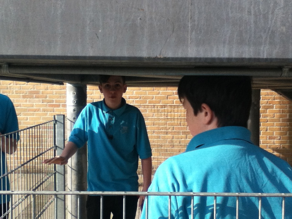
over the shoulderI really enjoyed this theme because you were able to be very creative in the fact you had to position the subject, the angle of the camera, and the background . Every single over the shoulder shot we took looked completely different and we could have only just changed the angle. I also think over the shoulder shoot is good because it adds mystery to the image as you only see part of the body and only part of the background which adds a really nice effect to the photo.
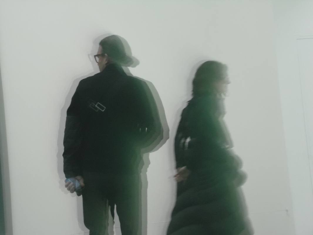
walk on byI didn't mind this theme because you don't need a high quality expensive camera to get the full effect of walk on by. The blur gives the image lots of movement creating adding a really nice effect to the image were as when there is no movement and blur in the image it looks really still and you don't get the full effect and i don't think you would understand the theme of the image. |
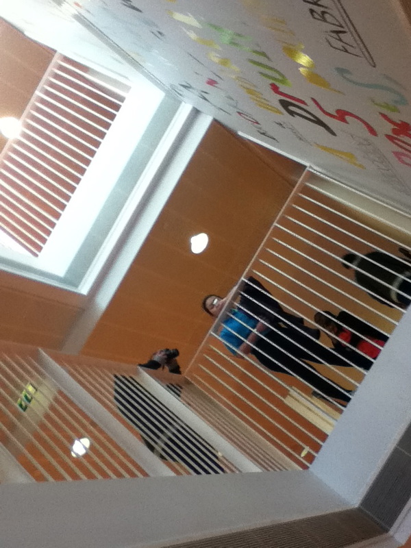
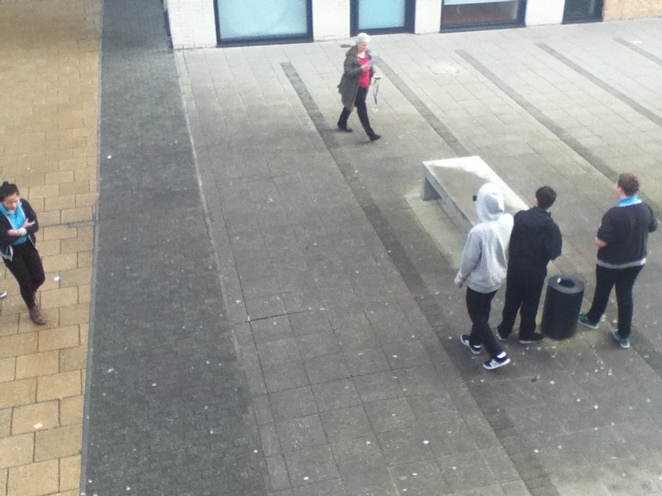
looking downLooking down, Putting / positioning yourself in a place when you can see all the events and objects below you. It could simply be classmates or just the surfaces on the floor below you. When doing the looking down theme you can change everything about the photo, by only changing the angle you take it at. It is almost like you get a new perspective to see things at every different angle. Because of the angle you can see a larger area so the person looking at the image can see more of what you could see and they get to feel like they are getting a better perspective of what the photographer is looking at.
CroppingThe cropping gives the person admiring the photograph the chance to use their imagination to think about what the persons face looks like and what the rest of their body is doing. Cropping in this case is natural they are not using any photo editing programs, the photographer is only photographing parts of something so that the effect of mystery is created.
Shadows and reflectionsShadows and reflections is quite a difficult thing to photograph and especially for shadows it is quite reliant on the weather to get the full effect of the shadows. The reflections was also quite challenging because a lot of the reflection images look very similar because there are very limited surfaces to create reflections on and many people will use the same surface and the unique aspect and the specialty of the image disperses. |


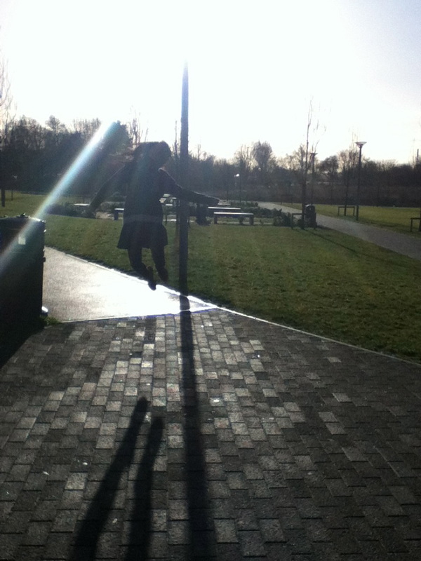
Evaluation of my best street photography image.
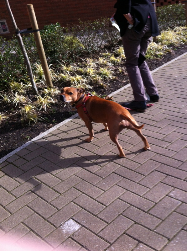
I think this is my best image in terms of street photography. This image leaves you with allot of questions such as; who is this girl, what is she looking at, what is she holding ect. I like this image because even though it was a snap shot the angle was spot on as it helped support the image. The girl in this image only takes up a small amount of positive space in the photograph, and the rest is negative space. because the negative space is filled with writing it doesn't give the image a feel of emptyness. Because of the words on the wall. I think it. makes you think about thinking if that makes sense, you think about the words written on the wall . I think that you try to imagine what the girl is thinking and because you do that you then start looking deeper into the image noticing that her eyes are looking up, so then you have more question like what is she looking up at and why is she standing there.
I think this is my best image in terms of street photography. This image leaves you with allot of questions such as; who is this girl, what is she looking at, what is she holding ect. I like this image because even though it was a snap shot the angle was spot on as it helped support the image. The girl in this image only takes up a small amount of positive space in the photograph, and the rest is negative space. because the negative space is filled with writing it doesn't give the image a feel of emptyness. Because of the words on the wall. I think it. makes you think about thinking if that makes sense, you think about the words written on the wall . I think that you try to imagine what the girl is thinking and because you do that you then start looking deeper into the image noticing that her eyes are looking up, so then you have more question like what is she looking up at and why is she standing there.
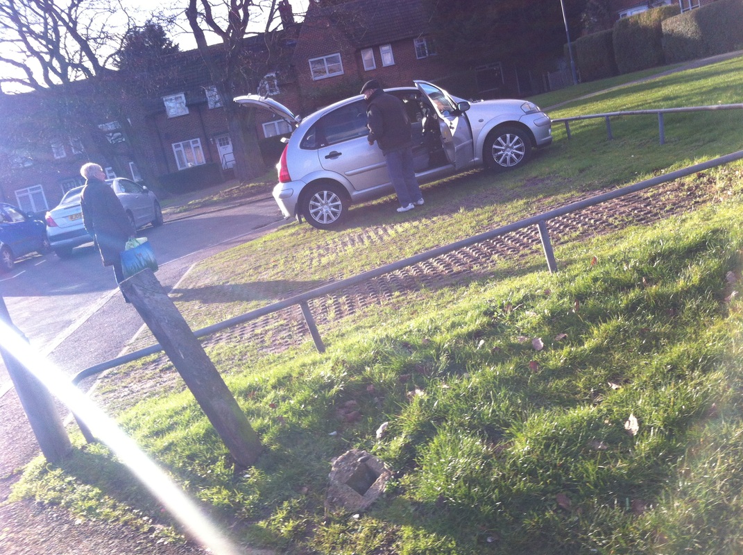

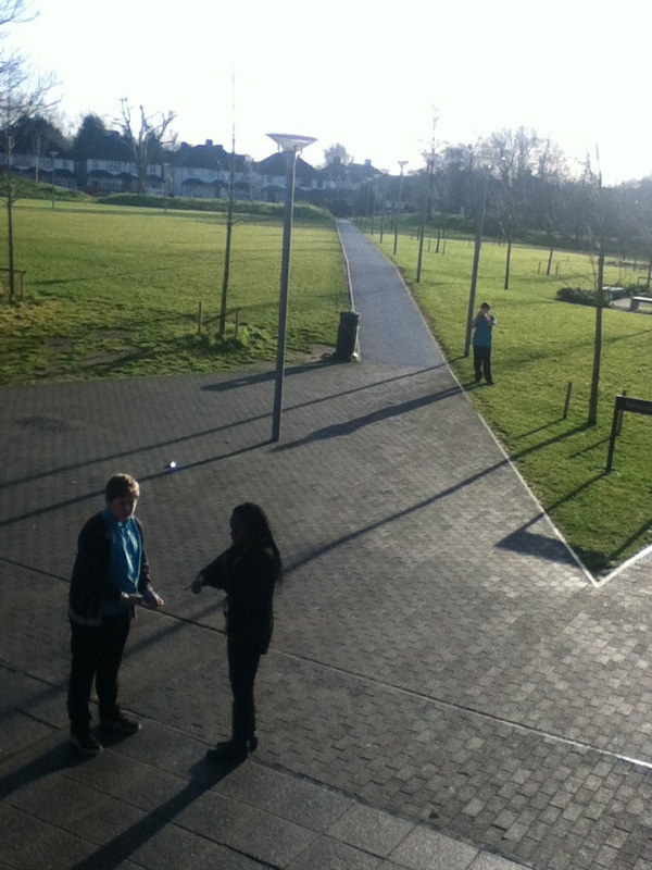
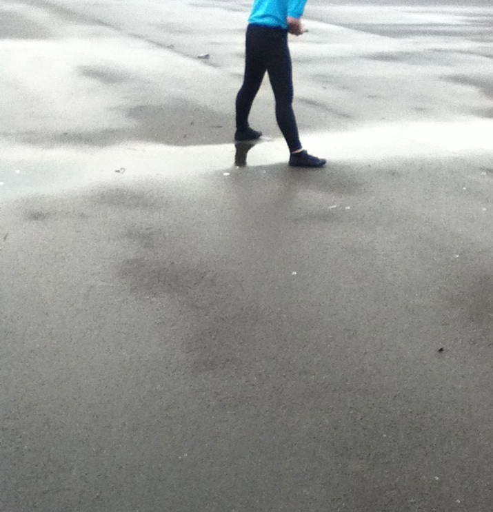
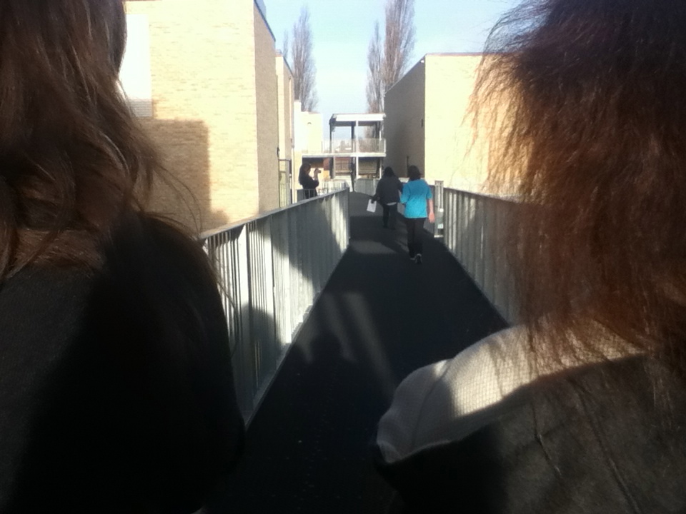
MY INDEPENDENT STREET PHOTOGRAPHY IMAGE
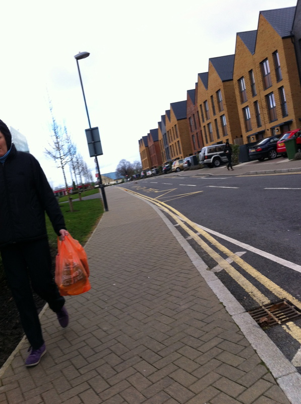
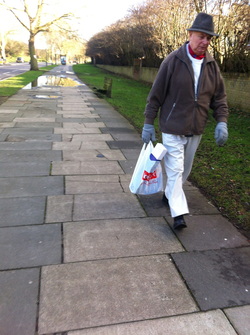
I think this is my best image as you have the man that is quite close up to the camera ! look at his facial expression it is so natural and it shows us a bit of their personality. From this image you can get a feel of what it is like outside, you can tell it is cold as the man has multiple layers of clothing on and he is wearing gloves and a scarf. Another reason i like this image is because the man only takes up a small part of the image, and the back ground is not empty space, you have the patterns of the pavement the puddle in the background with the slight green of trees and grass and you can see right into the distance just past the bus stop. This image has a lot of lines and layers in the photo. There is a lot of contrast in this image , maybe not very sharp contrast but subtle and soft so it doesn't draw attention to itself but instead makes you look at the rest of the image as well. after our lesson on triangles and diagonal lines i have started to automatically notice them in images such as this one. for example the zip of the mans jumper makes the rest of the white top underneath a triangular shape, he has triangle shapes in between his arms. some examples of diagonal lines or lines in general are the object in his shopping bag is a diagonal line and it is level and the line can continue with the zipper on his pocket right up to the corner of his hat. then you have his arms they are both diagonal lines and when the two lines intersect then thats were his head is.
I think this is my best image as you have the man that is quite close up to the camera ! look at his facial expression it is so natural and it shows us a bit of their personality. From this image you can get a feel of what it is like outside, you can tell it is cold as the man has multiple layers of clothing on and he is wearing gloves and a scarf. Another reason i like this image is because the man only takes up a small part of the image, and the back ground is not empty space, you have the patterns of the pavement the puddle in the background with the slight green of trees and grass and you can see right into the distance just past the bus stop. This image has a lot of lines and layers in the photo. There is a lot of contrast in this image , maybe not very sharp contrast but subtle and soft so it doesn't draw attention to itself but instead makes you look at the rest of the image as well. after our lesson on triangles and diagonal lines i have started to automatically notice them in images such as this one. for example the zip of the mans jumper makes the rest of the white top underneath a triangular shape, he has triangle shapes in between his arms. some examples of diagonal lines or lines in general are the object in his shopping bag is a diagonal line and it is level and the line can continue with the zipper on his pocket right up to the corner of his hat. then you have his arms they are both diagonal lines and when the two lines intersect then thats were his head is.
Rule of thirds
Rule of thirds: what is it
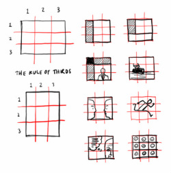
The rule of thirds is a guide line that photographers use to help them make a better and neater image.
As you can see by the image breaks up the images into 9 separate segments. This helps the photographer arrange their image. it is good for if they want a photograph with equal distance between all on the elements in their photograph as they can place one object in each of the boxes. some cameras such as the i phone have an option were you can see the grid and that gives the photographer some more assistance when taking photographs.if you have a picture of 3 people at the same height in a row they would normally go in the 3 boxes on the middle row . The reason for this grid is to assist the photographer in creating a well organised photo and to make the photo seem like there is more space between each segment.

In todays lesson i have learned that when doing the rule of thirds You don"t have to have 3 objects in the image but you can have one in the bottom left hand corner for example. I have also learned that there are a lot of ways you can arrange you images using the rule of thirds i all different ways and at different angles. You can use shadows instead of actual objects.
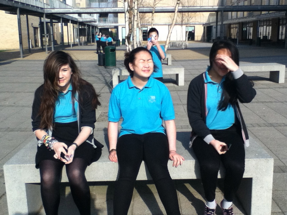
Reviewing a successful image
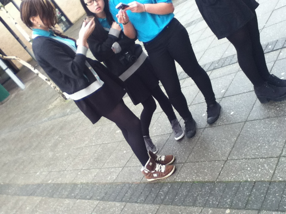
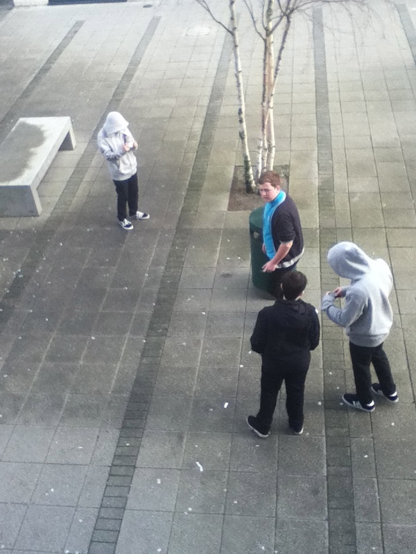
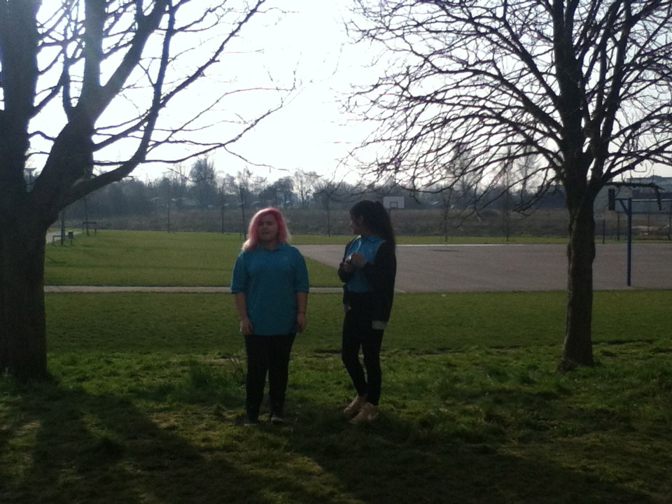
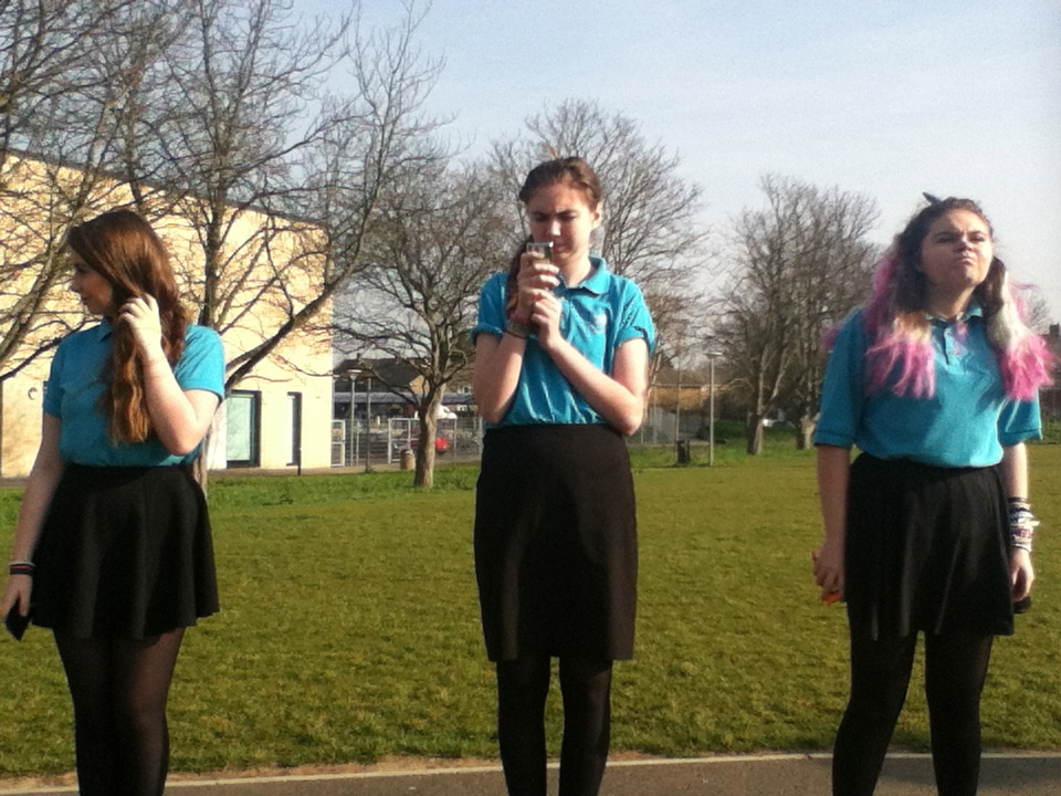
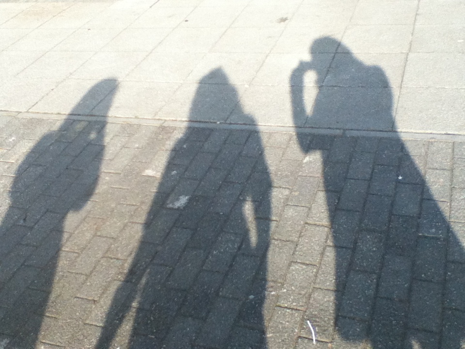
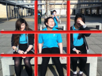
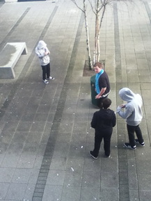
This image is one of my most successful image as the rule of thirds is very effective and it has worked very well. you have all 3 of their heads in the top 3 boxes all their bodies in the middle three and all their legs in the bottom row.I also like it because the 3 people within the image are central, and they stand out, they have equal space between them. The background of this image helps the people stand out as there are allot of neutral colours and the 3people are waring bright colours. One thing i dont like is that there is a boy in the back ground next time i would probly take this image from a lower point of view. |
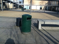
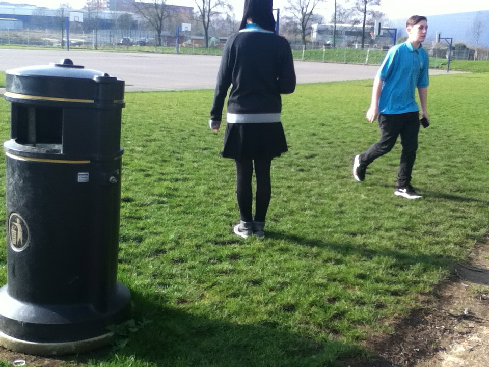
Unsuccessful image.
i think this was one of my unsuccessful images because the distance between the 3 main objects are not even and does not give off a neat 3 rule effect but instead makes the image look messy and unorganised. Also the shadows are all over the place taking away the focus from the main objects. The composition is 3 bold objects in the middle section of he image. They are all different distances from eachother. in the background there are trees and benches and more bins in front of another building. infront of the benches in the back ground there is a large empty space adding another layer to the image. To make this image better i would probably change the angle and maybe the height i took it from as the background draws attention from the main subjects and also would make the image look fuller so it would be easier to see the rule of thirds in this image. |
RULE OF THIRDS CHALLENGE
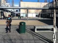
This image does not follow the rule of thirds because the 3 main subjects are not in the centre or the bottom or top section the a half way between the both so it doesn't have the effect that the rule of thirds does.
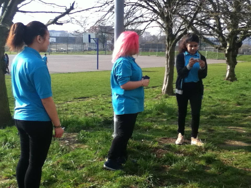
This does not fit in the rule of thirds because although there is 3 objects in 3 spaces equally spread the do cover the whole image but i have a feeling that this image maybe in the rule of thirds because the 3 sections and you can split it in to three cross ways as well, which makes me think it is, but there is no dominant subject becuase you have others that make you look away
This image was kind of a random shot but it worked because you have the two bold lines at the top and the bottom but then thew black / grey draws you attention
|
This image is not any of the rule of thirds because there is the building in the background and there is also 3 objects in the foreground that take your eyes away from the building but then the colours and boldness bring you back to the buildings. So you don't know were to look, your attention isn't drawn to one place.
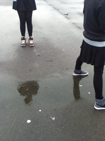
This image is a response to the rule of thirds challenge . this image does not follow the rule of thirds because it has no main subject, no main focus point that your eyes are drawn to. There are 2 people, a building in the background, in front of the building there is the links. in the foreground there is a bench so your eyes are kind of going all around the image looking at things to focus on but another thing steals your focus.
|
Diagonals
|
|
These are some images from the Erik Kim website. if you look at them it shows you all the qualities of a diagonal and what effect it has on the photograph. Diagonals can be used in many ways and street photographers use these to add effect to the image. IT makes you notice the image and look deeper to see if there are anymore diagonal lines.
|
|
What went well with the image of the stairs on the links. This image worked well because you can see many diagonal lines from different angles. I think this image was successful because it is unique and not man people notices it. I also like it because it makes you look deep into the photograph and you notice more diagonal lines.I also think this image worked because there are many layers as some are closer and brighter than others.
Even better if. To improve this image i would probably make it more central so that the people are not in the image and you can just focus on the diagonal lines and not get distracted by the people in the image.Also i may have tried to take it from a higher angle so that you can see more of the links and diagonal lines, and maybe slightly further back so that you can see more of the image and make the subject completely centeral. |
|
|
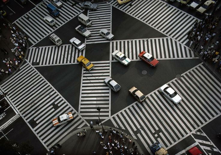
This is one of my favourite street photography images with lot of diagonal lines as it is taken from a birds eye view, (up high) I like the fact that all the diagonal lines are in the center of the image so that you can see all of them. This image was taken by Bruno Barbey in 1985. I think the place of the diagonal lines creates a nice effect on the photo almost creating another layer. I think this image is nice to look at because you have to look at all of the diagonals, also i like this because i try to count all of the diagonal lines but it is almost impossible and if you do u always lose count so have to start all over again. There are many cars in the road driving on top of the diagonal lines (one layer) The diagonal lines (another layer) and the bold black surface . The cars arrangement has no particular pattern, it is not in the rule of thirds now that i look at it most of the cars are moving / placed in a diagonal direction, The angle of the cars contrasts with the diagonal lines on the road which also adds another layer to the photograph.
|
Simularities and differences
fred herzog
|
Matt stuart
|
SIMULARITIES
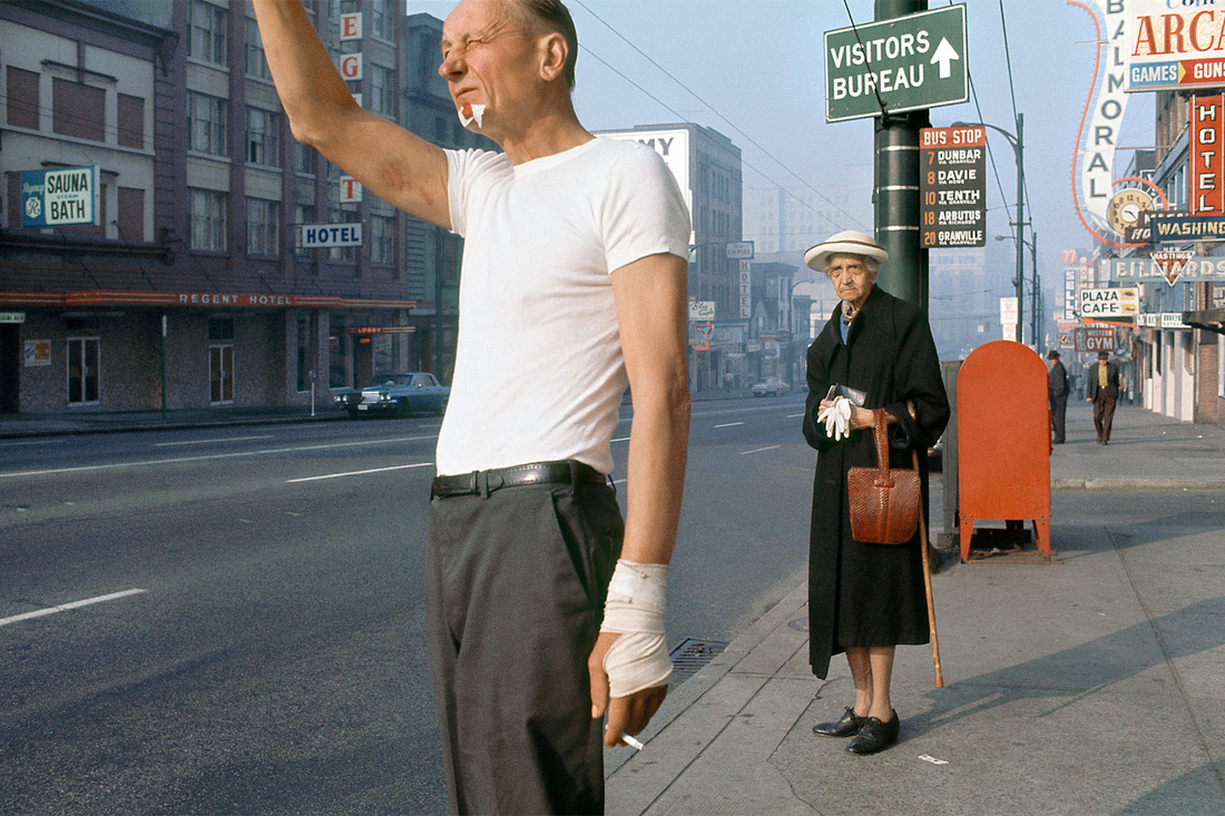
These images are both in colour, This shows that the images are fairly modern. They are both taken in public spaces, the one on the left is in a street by a bus stop and the one on the right is taken by a train station, there is a man standing waiting for a train with a sign that looks like it is picking his nose. These people , in the image, were probably both standing still when the image was taken this suggest that they are both waiting for something, in the man on the rights case he will probably be waiting or calling the bus and the man on the right is most likely waiting for the train and by the looks of his body position he has been waiting for a long time.. Both the people in the images are looking slightly to the side but forward showing that they are looking at something. Both of these images have many lines in them mostly in the background for example on the walls or ground ect. The people in the image are places slightly to the side of center, they both have another thing in the photos, the woman slightly back from the man at the bus stop, and in the other one the sign on the wall, this creates almost a second or third layer and something else to focus on. These other things in the image make the image seem fuller and complete the image. if these distractions so to say were not there then I don't think the image would have had such an effective effect as , definately the one on the right, draws you in to the photo because the sign is such a bright colour compared to the white of the walls.Both of these images have used a slight bit of cropping on the legs as you cant see their full body there is part of the leg missing.
These images are both in colour, This shows that the images are fairly modern. They are both taken in public spaces, the one on the left is in a street by a bus stop and the one on the right is taken by a train station, there is a man standing waiting for a train with a sign that looks like it is picking his nose. These people , in the image, were probably both standing still when the image was taken this suggest that they are both waiting for something, in the man on the rights case he will probably be waiting or calling the bus and the man on the right is most likely waiting for the train and by the looks of his body position he has been waiting for a long time.. Both the people in the images are looking slightly to the side but forward showing that they are looking at something. Both of these images have many lines in them mostly in the background for example on the walls or ground ect. The people in the image are places slightly to the side of center, they both have another thing in the photos, the woman slightly back from the man at the bus stop, and in the other one the sign on the wall, this creates almost a second or third layer and something else to focus on. These other things in the image make the image seem fuller and complete the image. if these distractions so to say were not there then I don't think the image would have had such an effective effect as , definately the one on the right, draws you in to the photo because the sign is such a bright colour compared to the white of the walls.Both of these images have used a slight bit of cropping on the legs as you cant see their full body there is part of the leg missing.
DIFFERENCES
The image by Fred Herzog is out side in the open were as the image by Matt Stuart is underground so not in the open and basically inside ths creates different effects in the photo for example because Fred Herzog's photograph is outside it means that the other objects in the photograph have got shadows, The woman the sign and you can see some of the man's shadow. Also in the image on the left you can all around like you can see the floor the houses in the background, this gives the image more space and it looks bigger. were as the other image you can only really see the sign not really the sides for that image it works because it makes you focus on the man and the sign and not look at anything else. In the picture on the right there is some little bits of black and white contrast that make the sign stand out because the contrast is so bold. In the photography on the left there are many different colours; blue, white, orange, green ect: were as the image on the left has less making the image look simpler and because the colours are quite light i think it gives the image quite a smooth texture but it also looks quite calm because nothing is really going on its not a very busy photograph. The image by fred herzog fits perfectly into the rule of thirds were as the one by matt stuart doesn't really, this means they both have completely different layouts as the subject of the Fred Herzog image is quite central, The image by Matt Stuart is on the left hand side of the image.
The image by Fred Herzog is out side in the open were as the image by Matt Stuart is underground so not in the open and basically inside ths creates different effects in the photo for example because Fred Herzog's photograph is outside it means that the other objects in the photograph have got shadows, The woman the sign and you can see some of the man's shadow. Also in the image on the left you can all around like you can see the floor the houses in the background, this gives the image more space and it looks bigger. were as the other image you can only really see the sign not really the sides for that image it works because it makes you focus on the man and the sign and not look at anything else. In the picture on the right there is some little bits of black and white contrast that make the sign stand out because the contrast is so bold. In the photography on the left there are many different colours; blue, white, orange, green ect: were as the image on the left has less making the image look simpler and because the colours are quite light i think it gives the image quite a smooth texture but it also looks quite calm because nothing is really going on its not a very busy photograph. The image by fred herzog fits perfectly into the rule of thirds were as the one by matt stuart doesn't really, this means they both have completely different layouts as the subject of the Fred Herzog image is quite central, The image by Matt Stuart is on the left hand side of the image.
My photographs for the gallery
Surfaces
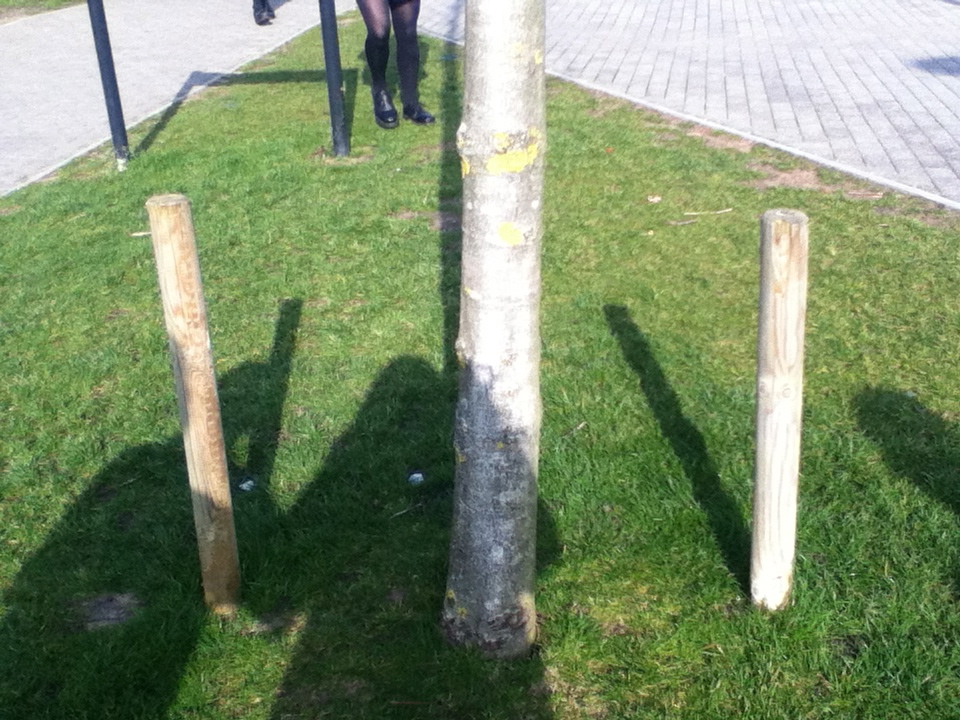
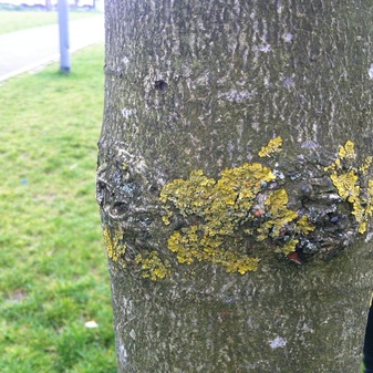
This is the image that I chose for surfaces, I chose this because it shows many different textures just on one surface. the different textures creates layers in the image. There are lots of different colours as well which makes your eyes be drawn to the yellow/green mid section on the tree trunk. this image was taken with an ipod, the angle is slightly to the right so that you can see some of the background. The main point of the image ( the trunk) is in focus, but the background is not and this makes the tree stand out even more.
over the shoulderI chose this image as my over the shoulder final piece because of how the image looks and what effects it creates. I like this image because it looks like it is a black and white photo but actually it looks that way because the glare of the sun is going right Into the lens, this means that the body / shoulder is made to look like a silhouette and that creates a really nice effect in the image. There is a lot of contrast in this image between the brightness of the sun and the shadows of the background. the rays from the sun give this image lots of lines and they over lap with the silhouette
|
Looking down I enjoyed this theme because it made you look at things from a different perspective. Looking back at the photos i realise how different the angle makes everything look different . By looking down you can see more because there is a wider angle and it spreads over a wider space. I think it makes you notice more like the lines on the ground and buildings, the shadows on the floor and walls. This image is one of my favourite looking down because the are lots of triangles, lines and other shapes in this image.
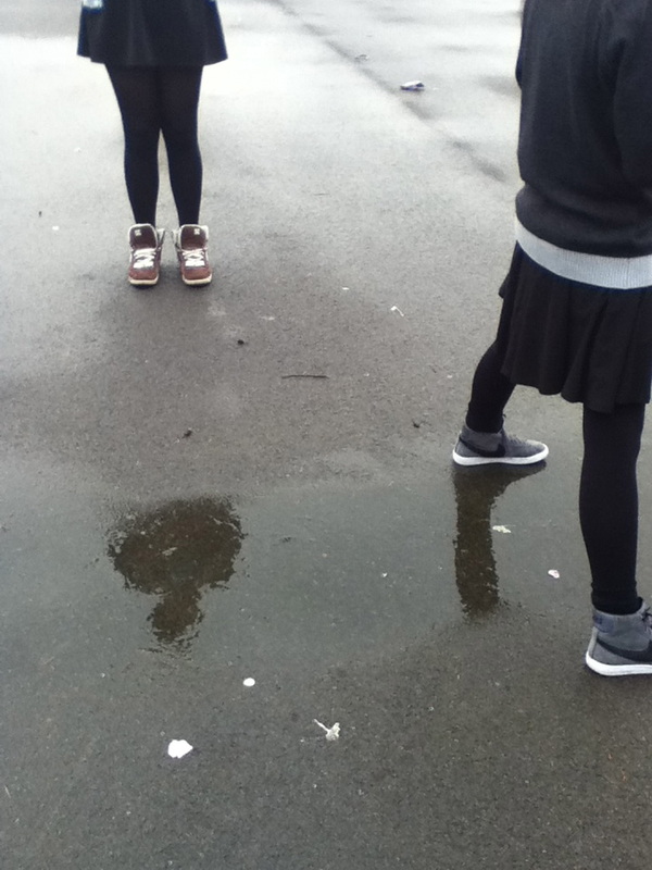
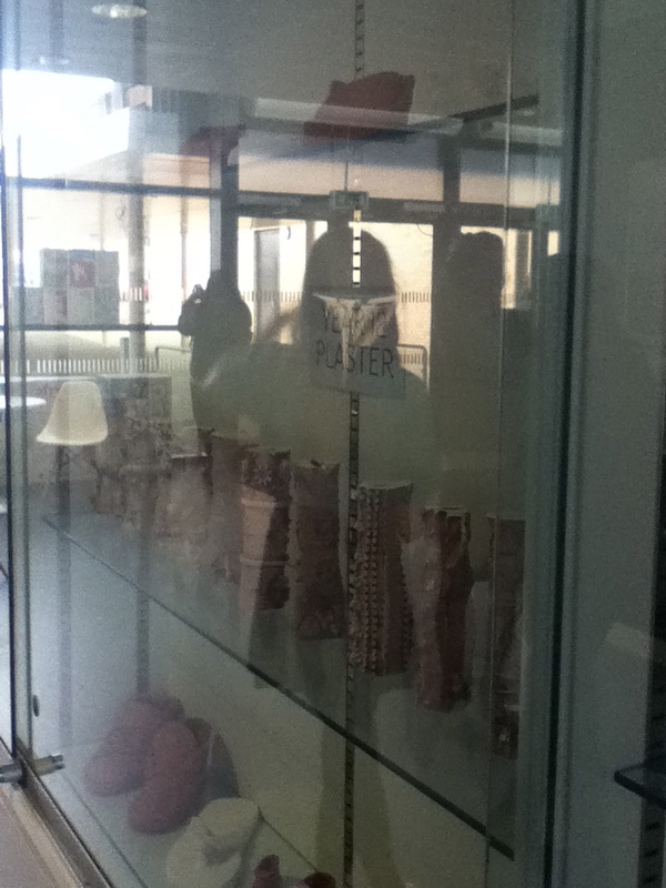
Shadows and reflectionsI chose this image as my shadow and reflections image because it stood out to me. I think it stood out because the reflections the water look like silhouettes so it makes you wonder I they are shadows or reflections. I also this this image was good to use because there is no one main subject there are little things scattered across the image which makes your eyes wonder across the page and you start to notice more within the image. in this image there are two cropped figures but all you can see are the legs, a puddle with the reflections in and the simple gravel floor.

|
Final challenge
Final Piece. |
Chris Porsz is the main focus in this video, we learn some of his photo techniques, for example he makes conversation with the subject of his photo to create a bond with them. Another technique he uses is eye contact with the subject and that also creates a bond for the photographer and for the person looking at the photograph. Chris Porsz chooses to photograph in Peterborough as 'it is rich with lots of photographic opportunities'. I think it was quite interesting to hear how much Chris Porsz says he has grown as a person, he says 'i have become more sociable, i was quite shy when i first started taking photograph.' I guess that this helped him in his job as well as a paramedic when talking to patients in the work place.
|

I have chosen these three image as my final piece for the street photography topic, each image has a common theme of having at least one person within each image, which allows the images to compliment each other well. However each image, contains different features that make each image differ from the next. For example the first image contains a large amount of vertical lines, as well as different tones within the images. The second/middle image also contains a large amount of line however it also contains a large depth of field which has been exaggerated by the reflection in the background and the harsh light that is falling on the elements within the background of the image. The final image, has a different focus, it is a reflection off of an unusual surface that has created a seemingly double exposure effect to the image, which has caused a lack in focus as well as adding tone and texture to the image.
Final Evaluation.
I have really enjoyed the Street photography topic as a whole, I was able to explore a new element to photography that i had not yet focused on. I feel that this topic has changed my perspective on the different elements surrounding me in my day to day life. I have also been able to experiment with the use of natural lighting within my images. I am also able to make quick decisions in order to capture the best image at that time. For example deciding the angle at which to capture the image. This project has allowed me to expand my knowledge and experience within different environments. I have been able to explore with the use of line and patterns within the images, This experimentation has allowed me to include a wider range of the formal elements within my images, for example: line, tone, texture. In order to make my images more appealing to the person viewing the images.
I have completed multiple artist research for example Chris Porzs, Fred Herzog, Matt Stuart, Martha Cooper. The research of these artist has helped me to focus my attention on the types of images and the themes that I can focus on, when taking a series of images.
